


Introduction to Collaboration & Social Data Analysis & Visualizations

The contemporary digital landscape is characterized by an ever-increasing volume and complexity of data originating from collaborative platforms and social interactions. This proliferation of interconnected information presents both opportunities and challenges for various fields, including engineering.
Extracting meaningful insights from this vast amount of data requires effective methodologies, and data visualization has emerged as a critical tool in this endeavor. For engineering disciplines, the ability to analyze and interpret collaborative and social data through visual representations can significantly enhance project management, infrastructure planning, and the understanding of user behavior, among other applications.
This chapter aims to provide a comprehensive overview of key data visualization techniques relevant to collaboration and social data analysis. The scope will encompass three primary areas. First, it will delve into graph visualization, a powerful approach for understanding relationships and networks inherent in collaborative and social interactions. Second, the chapter will explore the analysis of social data, with a specific focus on online platforms such as Twitter and the valuable insights that can be derived from Google Trends regarding public interest and sentiment.
Finally, it will examine geospatial data mapping, a technique essential for analyzing location-based data that often intersects with collaborative projects and social phenomena. By covering these areas, this chapter intends to equip engineering students with a solid foundation in these visualization techniques and their practical application in analyzing complex collaborative, social, and geospatial datasets.
Fundamentals of Graph Visualization
At its core, graph visualization involves representing structured information as diagrams of abstract graphs and networks 1. Formally, a graph is defined as an ordered pair G = (V, E), where V is a set of vertices (also known as nodes) representing individual entities, and E is a set of edges (also known as links) representing the connections or relationships between pairs of vertices 2. These nodes and edges can further possess attributes or properties that provide additional context and detail to the represented entities and their connections 3.
The significance of graph visualization lies in its ability to reveal intricate relationships and patterns that are often obscured within traditional tabular data formats 4. While the human brain can easily process small pieces of connected information, understanding complex networks with numerous entities and relationships becomes challenging when relying solely on lists or spreadsheets 3. Visualizing this data as a graph transforms the abstract into the intuitive, allowing analysts and researchers to readily identify trends, clusters, and anomalies that would otherwise remain hidden 4.
The advantages of employing graph visualization in data analysis are manifold. It offers a powerful means of simplifying complexity by allowing users to focus on the most important connections within the data 3. The human brain processes visual information at a significantly faster rate than textual data 4, making graph visualizations an efficient way to assimilate information and accelerate comprehension. Furthermore, interacting with visualized data encourages exploration and increases the likelihood of discovering deeper, actionable insights that might be missed through static reports or dashboards 4.
By providing a complete overview of how different entities are connected, graph visualization tools enable the identification of trends, relationships, patterns, and correlations within the data, offering a richer understanding of the problem at hand 4. Finally, visual representations serve as an effective form of communication, making it easier to share findings with decision-makers and stakeholders, even those without specific technical expertise in graph theory or data analysis 4.
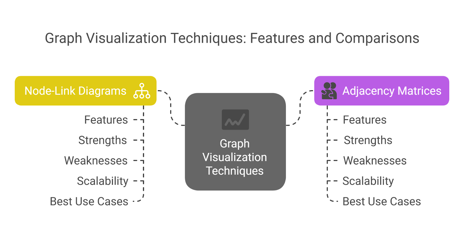
Graph Visualization Techniques
Various techniques exist for visualizing graph data, each with its own strengths and weaknesses depending on the characteristics of the data and the analytical tasks at hand. Two fundamental techniques are node-link diagrams and adjacency matrices.
Node-Link Diagrams: In this widely used technique, entities in the data are represented as nodes (often depicted as circles or other shapes), and the relationships between these entities are shown as lines (links or edges) connecting the nodes 3. Attributes of the nodes and edges can be further encoded using visual properties such as size, color, and labels 8.
Node-link diagrams excel at providing an intuitive representation of local network structures and are particularly effective for tasks such as following paths between nodes or examining the immediate connections of a specific entity, especially in networks of moderate size 8. They can also effectively illustrate distinct groups or partitions within the data 7.
However, a significant weakness of node-link diagrams is their tendency to become visually cluttered and difficult to interpret as the number of nodes and edges increases, often resulting in what is colloquially known as a "hairball" 8. In these diagrams, the spatial position of nodes is often determined by layout algorithms and may not directly encode any specific attribute of the dataset 8.
Moreover, in planar layouts of non-planar graphs, the crossing of edges can further hinder readability 7. Node-link diagrams find applications in various domains, including visualizing social networks to understand friendships or professional connections, mapping network infrastructure to identify dependencies, and illustrating relationships in biological datasets such as protein interactions.
Adjacency Matrices: An alternative approach to visualizing graphs is through the use of adjacency matrices 11. An adjacency matrix is a square matrix where both the rows and the columns represent the nodes in the graph.
The value at the intersection of a row and a column indicates whether an edge exists between the corresponding two nodes. Typically, a value of 1 signifies the presence of an edge, while a value of 0 indicates no direct connection. For weighted graphs, the matrix can store the weight or strength of the connection instead of a binary value 11.
A major strength of adjacency matrices is their efficiency in checking whether an edge exists between any two nodes, which can be done in constant time (O(1) complexity) 11. They are also memory-efficient for dense graphs, where a large proportion of possible edges are present 12.
Furthermore, adjacency matrices offer a straightforward implementation, making them suitable for computational tasks and algorithms that require matrix operations 12. However, for sparse graphs, where the number of edges is relatively small compared to the number of nodes, adjacency matrices can be memory-inefficient due to the need to store a value for every possible pair of nodes (O(n^2) space complexity) 11. Iterating over all the edges or finding the neighbors of a particular node can also be less efficient in sparse graphs compared to other representations 11.
Adjacency matrices are generally less intuitive for visually identifying paths or local structures in a network compared to node-link diagrams and are not ideal for very large, sparse graphs 12. They are often used in scenarios involving dense networks, in algorithms where quick edge lookups are crucial, and for representing connectivity in smaller graphs.

Beyond these two fundamental techniques, other relevant approaches exist for specific types of graph data or to address the limitations of node-link diagrams for large networks. For instance, hierarchical edge bundling can be used to visualize very large tree structures by bundling edges based on the hierarchy, reducing visual clutter 8. Radial layouts are also employed for tree structures, where the depth in the tree can be encoded as the distance from a central root node 10.
For very large and dense networks, matrix views offer an alternative by completely eliminating the occlusion issues of node-link diagrams and can be effective even at high information densities 10.

Tools and Software for Graph Visualization
A variety of software tools and platforms are available to facilitate the creation, exploration, and analysis of graph visualizations. These tools range from open-source libraries to commercial applications, each offering a unique set of features and capabilities.
Graphviz is an open-source graph visualization software package that allows users to create static graph diagrams from descriptions written in a simple text-based language called DOT 1. It supports several layout algorithms, enabling the generation of diagrams suitable for various graph structures, including hierarchical layouts for directed graphs (dot), spring-model layouts for general graphs (neato, fdp, sfdp), radial layouts (twopi), and circular layouts (circo) 15.
Graphviz can output diagrams in a wide range of formats, including images (PNG, JPEG, SVG), PDF, and Postscript, making it versatile for integration into web pages, documents, and other applications 15. Its applications span numerous technical domains, such as networking, bioinformatics, software engineering, and database design 1.
Gephi is another popular tool, serving as an open graph visualization and exploration platform 17. Unlike Graphviz, Gephi provides a user-friendly graphical interface, making it accessible to users without programming skills 18. It features a built-in rendering engine optimized for performance and supports various graph file formats, including GDF, GraphML, GML, NET, and GEXF 18. Gephi offers functionalities for exploratory data analysis through real-time network manipulation, link analysis to uncover associations between objects, and social network analysis to map community structures 18.
It also provides a range of built-in metrics, such as centrality measures, density, and clustering coefficients, and is highly customizable through plugins that can extend its capabilities for layouts, metrics, data sources, and more 18.
Other notable tools include Linkurious, which is often used for investigative purposes like fraud detection and security analytics, offering advanced search and filtering capabilities 17. KeyLines is a graph visualization SDK specifically designed for JavaScript developers, enabling the creation of custom interactive graph applications for web deployment 20.
Tom Sawyer Perspectives is a commercial platform that provides a comprehensive set of options for building graph visualization applications, with features like customizable tools, various layout styles, and integration with different web frameworks 21.
When selecting a graph visualization tool, several key features should be considered. The availability and types of layout algorithms are crucial for effectively arranging the nodes and edges of the graph. Interactivity, such as zooming, panning, and filtering, allows users to explore the data dynamically. Customization options for visual styling enable the tailoring of the visualization to highlight specific aspects of the data. The tool's ability to handle large datasets efficiently is essential for many real-world applications. Finally, integration capabilities with other data sources, databases, or analytical platforms can streamline workflows and enhance the overall analysis process 17.

Navigating Large and Complex Graphs
Visualizing large and highly interconnected graphs can present challenges due to visual clutter and the sheer volume of information. Effective navigation techniques are essential to enable users to explore and extract meaningful insights from such complex datasets.
Filtering is a powerful technique for reducing visual noise and focusing on specific subsets of the graph 3. By applying filters based on the attributes of nodes or edges, users can selectively display only the elements that meet certain criteria, such as specific node types, edge properties (e.g., strong connections), or data within a defined timeframe or geographic location 24.
Many graph visualization tools offer interactive filtering capabilities, allowing users to dynamically adjust the filters and explore different views of the data 3. For instance, users might filter a social network graph to show only connections within a particular age group or filter a network infrastructure map to highlight devices experiencing high traffic 24.
Additionally, some tools allow for showing or hiding entire clusters or groups of nodes, providing a higher-level overview of the network structure 24.
Zooming and panning are fundamental navigation techniques that allow users to examine the graph at different levels of detail 3. Interactive zooming enables the magnification of specific areas of interest, allowing for a closer inspection of individual nodes and their immediate connections 27.
Panning allows users to shift the visible portion of the graph, enabling the exploration of different regions of a large network 27. Most tools also provide a "reset zoom" function to quickly return to an overview of the entire graph 27. These basic interactions are crucial for navigating the spatial layout of the visualized network and examining both the macro and micro levels of connectivity.
The choice of layout algorithm significantly influences the interpretability of a graph, especially for large networks 8. Different algorithms arrange nodes and edges based on various aesthetic and structural criteria. For example, force-directed layouts treat nodes as repelling particles and edges as attractive forces, often resulting in aesthetically pleasing layouts that highlight natural clusters and overall network structure 16.
Hierarchical layouts are suitable for visualizing tree-like structures or directed acyclic graphs, where the direction of relationships is important 16. Circular layouts are useful for visualizing graphs with cyclic structures, such as certain telecommunications networks 16. For very large graphs, specialized algorithms like sfdp (a multi-scale force-directed algorithm) or techniques based on dimension reduction might be necessary to produce a comprehensible layout 30. The selection of an appropriate layout algorithm depends on the specific characteristics of the graph and the analytical goals.
Applications of Graph Visualization
Graph visualization has proven to be a valuable tool across a wide range of disciplines, particularly in analyzing collaborative and social data. Several key application areas highlight its utility.

In Social Network Analysis (SNA), graph visualization is fundamental for understanding relationships between individuals, groups, or organizations 3. By representing social connections as nodes and edges, analysts can identify influential actors within a network, discover communities or clusters of closely connected individuals, and trace the flow of information or resources 3. This is crucial in fields like sociology, marketing, and organizational management.
Cybersecurity leverages graph visualization to detect suspicious connections and patterns in network traffic, user activity, or system logs 4. Visualizing these relationships can help security analysts identify potential threats, such as malware propagation, unauthorized access, or insider threats, more effectively than by examining raw log data.
In Logistics and Operations, graph visualization aids in understanding complex supply chains and the interdependencies within infrastructure networks, such as energy grids or transportation systems 4. By visualizing the flow of goods, resources, or dependencies, engineers and analysts can identify potential bottlenecks, critical points of failure, or areas for optimization.
The detection of Financial Crime has also greatly benefited from graph visualization 4. By visualizing connections between financial accounts, transactions, individuals, and other entities, investigators can uncover complex fraud rings, identify suspicious patterns of activity, and trace the flow of illicit funds.
Beyond these, graph visualization finds applications in Knowledge Management, where it can represent the relationships between concepts, documents, experts, or other pieces of information to facilitate knowledge discovery, sharing, and collaboration within organizations 19. The ability to see how different elements of knowledge are connected can lead to new insights and more effective problem-solving.
Social Data & Online Networks
Understanding Social Data
The digital age has ushered in an era of unprecedented social connectivity, resulting in the generation of vast amounts of social data 33. This term broadly refers to data that originates from social interactions, encompassing user-generated content, the expressed or implicit relationships between people, and the behavioral traces left on digital platforms 35. Understanding the nature of this data is crucial for engineers seeking to leverage it for various applications.

Online social media platforms are the primary sources of much of this social data. These platforms are inherently internet-based, allowing users from across the globe to connect and share information in real-time 34. The core of these platforms is user-generated content, which can range from text updates and comments to images, videos, and reviews 34.
Furthermore, social media platforms provide networking services, enabling users to create profiles, connect with others, and form relationships that facilitate the rapid spread of information and the emergence of trends 34.
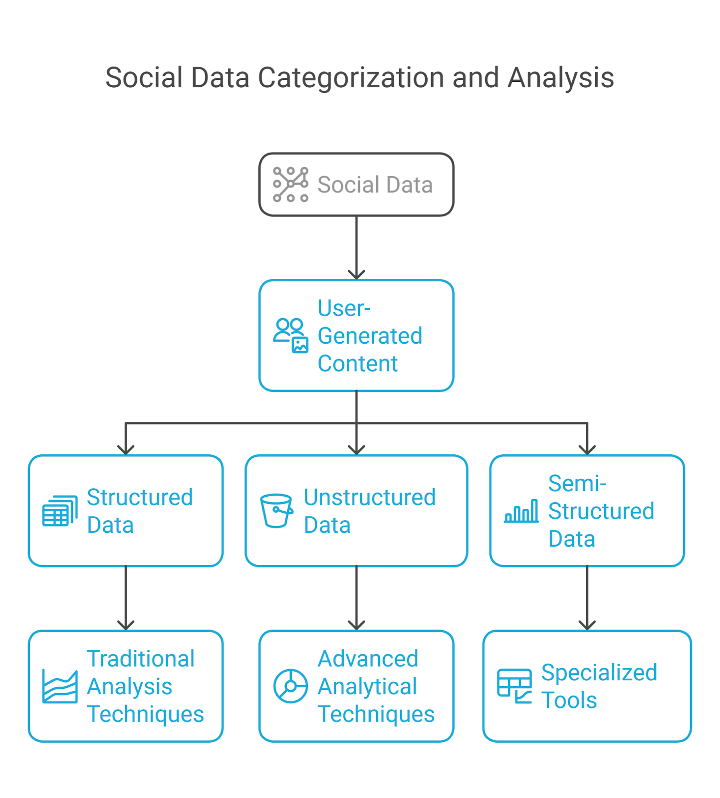
Social data can be broadly categorized into three types based on its structure and analyzability. Structured data is highly organized and easily quantifiable, often taking the form of numerical data or predefined categories. Examples include user profile information (like age, location), the number of likes or shares a post receives, and the count of URL clicks 34.
This type of data is amenable to traditional data analysis techniques. In contrast, unstructured data is more complex and does not conform to predefined formats, making it less straightforward to analyze. It includes textual content from posts, comments, and reviews, as well as multimedia elements like images and videos 34. Extracting meaningful insights from unstructured data often requires advanced analytical techniques such as text analytics, natural language processing (NLP), and image recognition 34.
Finally, semi-structured data represents a hybrid, possessing some organizational properties but still requiring specialized tools for analysis. Examples include metadata or tags associated with images and videos, which provide some context but are not as rigidly formatted as structured data 34.
Structure of Online Social Networks
Analyzing social data often involves understanding the underlying structure of the online social networks from which it originates. These networks can be conceptualized as graphs, where nodes represent individual users or entities, and edges represent the relationships or connections between them 37.
Several key properties characterize the structure of social networks. Density refers to the proportion of potential connections that are actually present in the network 39. The diameter is the longest shortest path between any two nodes in the network, providing a measure of its overall reach 39. Centrality measures the importance of a node within the network and can be assessed through various metrics, including degree centrality (the number of direct connections a node has), betweenness centrality (the number of times a node lies on the shortest path between two other nodes, indicating its role as a broker), and closeness centrality (the average distance of a node to all other nodes in the network) 39. Different types of networks exist, each with distinct structural characteristics.
Ego networks focus on a single node and its direct connections 39. Whole networks encompass an entire organization or system 39. Scale-free networks are characterized by a degree distribution that follows a power law, meaning a few nodes (hubs) have a very large number of connections, while most nodes have very few 38.
Twitter, as a prominent online social network, exhibits a unique structure. Unlike many other social platforms, relationships on Twitter are primarily directed; a user following another user does not necessarily imply that the latter follows back 41. By default, tweets posted by users are public, making them visible to anyone, whether or not they have a Twitter account 41. Users on Twitter frequently employ hashtags (words or phrases prefixed with a "#" symbol) to categorize their tweets and participate in or follow discussions on specific topics 42.
The retweet mechanism allows users to easily share tweets from others with their own followers, leading to rapid information diffusion across the platform 42. Additionally, Twitter allows users to organize the accounts they follow into lists, enabling them to segregate their audience into different groups based on interests or other criteria 41.
7.3.3 Analyzing Twitter/X Data
Analyzing the vast amounts of data generated on Twitter can provide valuable insights into public opinions, trends, and events. Several methods and metrics are employed in this analysis.
Accessing Twitter data for analysis can be achieved through various means. Twitter provides APIs (Application Programming Interfaces) that allow developers and researchers to programmatically access and retrieve tweet data based on specific criteria, such as keywords, hashtags, or user accounts 42. Numerous third-party tools and libraries have also been developed to facilitate this process, including twarc, a command-line tool and Python library for archiving Twitter data; rtweet and academictwitteR, R packages designed for accessing and analyzing Twitter data, particularly through the Academic Research API; and Social Feed Manager, an open-source tool for collecting data from multiple social media platforms, including Twitter 46.
It is important to note that accessing Twitter data, especially through the API, is subject to certain limitations, including rate limits on the number of requests that can be made within a given timeframe 48.
Several common metrics are used to analyze Twitter data and assess the performance and impact of tweets and user activity. Engagement rate is a key metric that measures the level of interaction a tweet receives from users, including likes, retweets, replies, and clicks on links or media 49. Impressions refer to the total number of times a tweet is displayed to users, while reach indicates the number of unique users who have seen a particular tweet 49. Follower growth tracks the change in the number of followers an account has gained over a specific period, providing an indication of audience growth 49. The performance of hashtags used in tweets can also be analyzed to understand their effectiveness in reaching a wider audience and contributing to discussions 49.

Various analytical approaches can be applied to Twitter data to extract meaningful insights. Sentiment analysis utilizes Natural Language Processing (NLP) techniques to determine the emotional tone expressed in tweets, classifying them as positive, negative, or neutral 36. This can be valuable for understanding public opinion towards a brand, product, or event. Trend analysis involves identifying emerging topics and tracking their popularity and evolution over time, often using metrics like hashtag usage and the frequency of specific keywords 36.
Network analysis can be performed on user interactions, such as mentions and retweets, to map the relationships between users, identify communities of interest, and understand the flow of information within the Twitter ecosystem 55. Analyzing Twitter data can yield various insights, such as understanding public reaction to a new product launch by examining the sentiment of tweets mentioning the product, tracking the spread of information or misinformation during a crisis by monitoring relevant hashtags and user interactions, and identifying key influencers within a specific industry or domain based on their follower count and engagement metrics 36.

7.3.4 Utilizing Google Trends for Social Data Analysis
While not a direct social media analytics tool, Google Trends provides valuable insights into public search interest, which can be a strong indicator of broader social trends and concerns 58. Google Trends analyzes a sample of Google web searches to determine the relative popularity of search terms over time and across different geographic regions 58.
This data is normalized on a scale from 0 to 100, where 100 represents the peak search interest for a given term during the specified time period 58. It is important to note that Google Trends typically does not provide the absolute number of searches for a term by default 61.
Google Trends has several applications relevant to social data analysis. It can be used to identify trending topics in real-time or over a specified period, providing insights into what subjects are currently capturing public attention 64.
For keyword research, it allows users to explore the relative search interest for different terms, helping to understand the language and concepts people are using when seeking information 64. Google Trends can also reveal seasonal trends in search interest, indicating when certain topics are likely to peak in popularity throughout the year 64. By comparing search interest for different terms, users can benchmark against industry trends and understand the relative popularity of their brand or related concepts compared to competitors 64.
Monitoring search terms related to a business or topic can also provide insights into brand awareness and public perception 64. Furthermore, the data from Google Trends can be invaluable for informing content strategy, helping to identify topics with growing interest that might be worth covering 64. Beyond these applications, Google Trends can also be utilized to understand public interest in various social phenomena, including health-related topics, political events, and economic trends 67.
Despite its utility, Google Trends has several limitations. As mentioned, it provides relative data, not absolute search volumes, which can make it difficult to gauge the true scale of interest in a topic 61. The data is based on a sampled subset of Google searches, which may lead to slight inconsistencies in results over time 62. There can also be ambiguity in search terms, where Google Trends might not differentiate between different meanings of the same word (e.g., "apple" the fruit vs. "Apple" the company) 62. Google Trends filters out search queries made by very few people, duplicate searches from the same user over a short period, and queries containing apostrophes or other special characters 58.
Finally, it is important to remember that Google Trends reflects search interest, not necessarily overall popularity or viewership, and should not be interpreted as a scientific poll 59.
Geospatial Data Mapping
Principles of Geospatial Data Mapping
Geospatial data is fundamentally about linking information to specific geographic locations on or near the Earth's surface 71. This data typically combines location information, attribute information describing the characteristics of the object or event, and often temporal information indicating when the location and attributes existed 71. GIS (Geographic Information Systems) are computer systems designed to capture, store, manipulate, analyze, manage, and present this geospatial data 72.

The importance of geospatial data mapping in data analysis lies in its ability to reveal spatial patterns, relationships, and trends that are often not apparent when data is presented in non-spatial formats like tables or charts 73.
For various engineering fields, including civil engineering, environmental engineering, and urban planning, the ability to visualize and analyze location-based data is essential for informed decision-making, such as infrastructure development, resource management, and urban design.
Several key properties define geospatial data. Coordinate systems are frameworks used to define the location of features on the Earth's surface. These can be geographic coordinate systems, which use latitude and longitude to specify locations on a spherical or ellipsoidal model of the Earth, or projected coordinate systems, which are planar, two-dimensional representations of the Earth's surface derived from geographic coordinates 75.
Map projections are the mathematical methods used to transform the Earth's curved surface onto a flat map, a process that inevitably introduces some form of distortion in properties like shape, area, distance, or direction 77. Different map projections are designed to preserve specific properties depending on the map's purpose 80. Scale refers to the ratio between a distance measured on a map and the corresponding distance on the ground 84.
Accuracy in geospatial data refers to how well the information presented on the map matches the real-world locations and features it represents 84.
When creating geospatial maps, several design principles should be considered to ensure effective communication. Legibility is the ability of map features and labels to be easily seen and understood. Visual contrast relates to how map features and page elements stand out from each other and their background, ensuring clarity. Figure-ground organization helps the map reader identify the area of focus. Hierarchical organization visually separates the map into layers of information to indicate relative importance. Finally, balance involves the arrangement of map elements on the page to create a sense of equilibrium and harmony 85.
Types of Geospatial Data
Geospatial data can be broadly categorized into two primary types: vector data and raster data 73.
Vector data represents discrete geographic features using geometric primitives: points, lines, and polygons 72. Points are used to represent single locations, such as the location of sensors, individual trees, or points of interest. Lines represent linear features like roads, rivers, pipelines, or utility lines. Polygons are used to represent areas with defined boundaries, such as buildings, land parcels, administrative zones (e.g., city boundaries, states), or lakes. Associated with vector data is an attribute table, which stores descriptive information about each geographic feature. For example, a line representing a road might have attributes such as its name, length, and number of lanes 87. Vector data is particularly well-suited for representing features with discrete boundaries.

Raster data, on the other hand, represents continuous geographic phenomena as a grid of equally sized cells or pixels, arranged in rows and columns 72. Each cell in the raster grid contains a value that represents a specific attribute or measurement for the area covered by that cell.
Common examples of raster data include satellite imagery, aerial photographs, digital elevation models (DEMs) that represent terrain elevation, temperature grids showing temperature variations across a region, and land cover maps indicating different types of vegetation or land use. Raster data is effective for representing phenomena that vary continuously across space, such as elevation, temperature, or precipitation, as well as for imagery.
The choice between vector and raster data models depends on the nature of the geographic feature or phenomenon being represented and the type of analysis intended. Vector data is typically used for features with well-defined boundaries and is suitable for tasks like calculating lengths or areas.
Raster data is more appropriate for representing continuous fields and for performing spatial analysis that involves the values of neighboring cells, such as in environmental modeling or image processing.
Common Geospatial Data Visualization Techniques
Various visualization techniques are used to represent geospatial data effectively, each suited for different types of data and analytical objectives.

Choropleth maps are a common technique used to display data that is aggregated by geographic or political boundaries 90. These maps divide the area being mapped into these predefined regions (e.g., countries, states, counties) and then use different colors or shades to represent the values of a particular variable within each region. Typically, the intensity of the color corresponds to the magnitude of the variable being displayed, with darker shades often indicating higher values 92.
Choropleth maps are useful for visualizing geographic clusters or concentrations of data and for intuitively comparing how a measurement varies across different areas 91. However, a potential pitfall is that large differences in the size of the geographic areas can lead to misinterpretation, with larger areas sometimes drawing undue visual attention regardless of their data value (the "Alaska effect") 92. It is generally recommended to use normalized data (e.g., population density or rates per capita) rather than raw counts on choropleth maps to avoid skewing the visualization based on the size of the population or area 91.
Heatmaps provide another way to visualize geospatial data by representing the density or intensity of data points across a geographic area using a continuous spectrum of colors 90. These maps are particularly effective for identifying "hot spots" or areas with a high concentration of the variable being studied 97.
The intensity of the color in a heatmap typically indicates the density or magnitude of the data, with warmer colors (like red or orange) often representing higher concentrations and cooler colors (like blue or green) representing lower concentrations 100.
Unlike choropleth maps, heatmaps do not rely on predefined geographic boundaries and can be useful for visualizing continuous data or large numbers of discrete points.
Proportional symbols are used to represent data values at specific geographic locations by placing symbols (such as circles, squares, or other shapes) on the map, with the size of each symbol being directly proportional to the value of the data at that location 98.
This technique allows for the visualization of quantitative data at discrete points. In some cases, both the size and color of the symbols can be varied to represent multiple variables simultaneously 97. The interpretation of these maps is generally straightforward, with larger symbols indicating larger data values 107.
Proportional symbol maps are useful for showing the spatial distribution of quantitative data and for highlighting areas with higher or lower magnitudes of the variable of interest.
Flow maps are specifically designed to visualize the movement of objects, such as people, goods, traffic, or even abstract concepts like information, from one geographic location to another 91. These maps typically use lines or arrows to represent the paths of movement, with the direction of the flow indicated by the arrow's head 91.
The thickness or width of the lines often corresponds to the quantity or volume of the flow, allowing for a visual representation of the magnitude of movement between locations 91.
Color can also be used to encode additional attributes of the flow, such as its type or intensity 108. Flow maps provide a clear and intuitive way to understand patterns of movement and connectivity across geographic space.


Conclusion
This chapter has explored the critical role of data visualization in the context of collaboration and social data analysis, specifically focusing on graph visualization, social data analysis involving Twitter and Google Trends, and geospatial data mapping. The increasing volume and complexity of data in these domains necessitate effective visual strategies to extract meaningful insights for engineering applications.
Graph visualization provides a powerful means to understand intricate relationships and network structures, simplifying complexity and facilitating faster comprehension of connected data. Techniques like node-link diagrams and adjacency matrices offer different perspectives on these relationships, with the choice depending on the data characteristics and analytical goals. A variety of tools, such as Graphviz and Gephi, are available to create and explore graph visualizations, and effective navigation techniques, including filtering, zooming, and appropriate layout algorithms, are crucial for analyzing large and complex networks.
The analysis of social data, particularly from platforms like Twitter, offers real-time insights into public opinions, trends, and network dynamics. Understanding the structure of online social networks and utilizing appropriate metrics and analytical approaches, such as sentiment and trend analysis, allows engineers to gain valuable context for their projects and fields. Google Trends, while not a direct social media tool, serves as a valuable indicator of public search interest, reflecting broader social trends and providing insights for keyword research and understanding evolving information landscapes.
Geospatial data mapping is essential for visualizing and analyzing location-based information, revealing spatial patterns and trends crucial for various engineering disciplines. Understanding the principles of geospatial data, including coordinate systems, map projections, and different data types (vector and raster), is fundamental. Common visualization techniques like choropleth maps, heatmaps, proportional symbols, and flow maps each offer unique ways to represent spatial data and support location-based decision-making.
The interdisciplinary nature of collaboration and social data analysis draws from computer science, social sciences, and engineering principles. As the world becomes increasingly data-driven, the skills to effectively visualize and interpret these complex datasets are becoming ever more important for engineering students. The ability to transform raw, intricate data into understandable and actionable insights through visualization is a powerful tool for fostering innovation, solving complex problems, and ultimately advancing the field of engineering.
References :
graphviz.org, accessed on March 25, 2025,
https://graphviz.org/#:~:text=Graph%20visualization%20is%20a%20way,interfaces%20for%20other%20technical%20domains.
An Introduction to Graph Theory - DataCamp, accessed on March 25, 2025, https://www.datacamp.com/tutorial/introduction-to-graph-theory
The Fundamentals of Graph Visualization - Cambridge Intelligence, accessed on March 25, 2025, https://cambridge-intelligence.com/graph-viz-basics-pt1-why-graphs/
Graph visualization: What it is and why it matters - Linkurious, accessed on March 25, 2025, https://linkurious.com/blog/why-graph-visualization-matters/
Why Data Visualization Is Important | Premier International, accessed on March 25, 2025, https://www.premier-international.com/articles/why-data-visualization-is-important
The Importance of Data Visualization in the Digital Age | Datylon, accessed on March 25, 2025, https://www.datylon.com/blog/why-is-data-visualization-important
Node, Node-Link, and Node-Link-Group Diagrams: An Evaluation - UC Davis Center for Visualization, accessed on March 25, 2025, https://vis.cs.ucdavis.edu/vis2014papers/TVCG/papers/2231_20tvcg12-saket-2346422.pdf
Statistical Data Visualization: Node - Link Diagrams - GitHub Pages, accessed on March 25, 2025, https://krisrs1128.github.io/stat479/posts/2021-03-06-week8-2/
Fundamentals of Data Visualization Explained - Sprintzeal.com, accessed on March 25, 2025, https://www.sprintzeal.com/blog/fundamentals-of-data-visualization
www.csl.mtu.edu, accessed on March 25, 2025, https://www.csl.mtu.edu/cs5631.ck/common/09-Network-Tree.pdf
Graph Data Structures | Baeldung on Computer Science, accessed on March 25, 2025, https://www.baeldung.com/cs/graphs
Graph Basics Adjacency Matrix, accessed on March 25, 2025, https://blog.heycoach.in/graph-basics-adjacency-matrix/
What is better, adjacency lists or adjacency matrices for graph problems in C++?, accessed on March 25, 2025, https://stackoverflow.com/questions/2218322/what-is-better-adjacency-lists-or-adjacency-matrices-for-graph-problems-in-c
Graph Data Structure: Exploring Adjacency List and Adjacency ..., accessed on March 25, 2025, https://medium.com/@ajithr116/graph-data-structure-exploring-adjacency-list-and-adjacency-matrix-dfs-and-bf-d14bed493490
Graphviz, accessed on March 25, 2025,
https://graphviz.org/
Graphviz - Graph Visualization Software, accessed on March 25, 2025,
https://emden.github.io/
Best Graph Database Visualization Tools - PuppyGraph, accessed on March 25, 2025, https://www.puppygraph.com/blog/graph-database-visualization-tools
Gephi - The Open Graph Viz Platform, accessed on March 25, 2025,
https://gephi.org/
Graph Visualization Use Cases - Cambridge Intelligence, accessed on March 25, 2025, https://cambridge-intelligence.com/graph-visualization-use-cases/
Graph Visualization - Cambridge Intelligence, accessed on March 25, 2025, https://cambridge-intelligence.com/graph-visualization-software/
Graph visualization tools - Getting Started - Neo4j, accessed on March 25, 2025, https://neo4j.com/docs/getting-started/graph-visualization/graph-visualization-tools/
Graph Visualization | Tom Sawyer Software, accessed on March 25, 2025, https://www.tomsawyer.com/graph-visualization
9 Key Features of Enterprise Data Visualization Software - Yellowfin, accessed on March 25, 2025, https://www.yellowfinbi.com/blog/9-key-features-of-enterprise-data-visualization-software
Filtering Functionality | Eliminate Noise In Your Graph Data, accessed on March 25, 2025, https://cambridge-intelligence.com/filtering/
Graph Filters - Ardoq Help, accessed on March 25, 2025, https://help.ardoq.com/en/articles/44058-graph-filters
Filtering data in one visualization - IBM, accessed on March 25, 2025, https://www.ibm.com/docs/en/cognos-analytics/11.1.0?topic=filters-filtering-data-in-one-visualization
Zoom and pan on charts | Looker Studio | Google Cloud, accessed on March 25, 2025, https://cloud.google.com/looker/docs/studio/zoom-and-pan-on-charts
Zooming and Moving the View of a Graph or Chart - NI - National Instruments, accessed on March 25, 2025, https://www.ni.com/docs/en-US/bundle/labview/page/zooming-and-moving-the-view-of-a-graph-or-chart.html
Two Novel Techniques for Interactive Navigation of Graph Layouts - A Rostock, accessed on March 25, 2025, https://vca.informatik.uni-rostock.de/~ct/publications/Tominski09GraphNavigation.pdf
Additional Layout Algorithms for Network Visualizations • graphlayouts, accessed on March 25, 2025, https://schochastics.github.io/graphlayouts/
Force-directed graph drawing - Wikipedia, accessed on March 25, 2025, https://en.wikipedia.org/wiki/Force-directed_graph_drawing
Large Graph Visualization Tools and Approaches | by Sviatoslav ..., accessed on March 25, 2025, https://medium.com/data-science/large-graph-visualization-tools-and-approaches-2b8758a1cd59
VALUING SOCIAL DATA - Columbia Law Review, accessed on March 25, 2025, https://columbialawreview.org/content/valuing-social-data/
Understanding Social Data Features, Types, and Challenges, accessed on March 25, 2025, https://www.ashokcharan.com/Marketing-Analytics/~sma-understanding-social-data.php
Social Data: Biases, Methodological Pitfalls, and Ethical Boundaries - PMC, accessed on March 25, 2025, https://pmc.ncbi.nlm.nih.gov/articles/PMC7931947/
Twitter Sentiment Analysis With Python: Introduction & Techniques, accessed on March 25, 2025, https://www.analyticsvidhya.com/blog/2021/06/twitter-sentiment-analysis-a-nlp-use-case-for-beginners/
What is Online Social Network | IGI Global Scientific Publishing, accessed on March 25, 2025, https://www.igi-global.com/dictionary/constructing-community-higher-education-regardless/21064
Social network - Wikipedia, accessed on March 25, 2025, https://en.wikipedia.org/wiki/Social_network
Social Network Analysis 101: Ultimate Guide, accessed on March 25, 2025, https://visiblenetworklabs.com/guides/social-network-analysis-101/
Structure and Evolution of Online Social Networks, accessed on March 25, 2025, http://snap.stanford.edu/class/cs224w-readings/kumar06evolution.pdf
Twitter Features/Characteristics: How is Twitter Different?, accessed on March 25, 2025, https://www.ashokcharan.com/Marketing-Analytics/~tw-twitter-how-different.php
What is Twitter, a Social Network or a News Media?, accessed on March 25, 2025, http://snap.stanford.edu/class/cs224w-readings/kwak10twitter.pdf
How to analyze tweets on X? A step by step guide - ATLAS.ti, accessed on March 25, 2025, https://atlasti.com/research-hub/the-use-of-atlas-ti-to-analyse-tweets-a-step-by-step-user-guide
List of Twitter features - Wikipedia, accessed on March 25, 2025, https://en.wikipedia.org/wiki/List_of_Twitter_features
twitter IDs, data analysis - python - Stack Overflow, accessed on March 25, 2025, https://stackoverflow.com/questions/75153612/twitter-ids-data-analysis
guides.libraries.psu.edu, accessed on March 25, 2025, https://guides.libraries.psu.edu/c.php?g=796631&p=5698003#:~:text=Working%20with%20Tweets&text=You%20can%20use%20NCapture%20to,can%20view%20tweets%20for%20coding.&text=A%20Python%2Dbased%20tool%20created,working%20with%20social%20media%20text.
Collecting Tweets - Twitter Research Guide - Library Guides at Penn ..., accessed on March 25, 2025, https://guides.libraries.psu.edu/c.php?g=796631&p=5698003
How I get Tweet data for FREE in 2024 as a data scientist - YouTube, accessed on March 25, 2025,
Twitter Metrics: Top 11 KPIs to Track in 2025 - Socialinsider, accessed on March 25, 2025, https://www.socialinsider.io/blog/twitter-metrics/
13 X (Twitter) Metrics Brands Should Track in 2024 - Sprinklr, accessed on March 25, 2025, https://www.sprinklr.com/blog/twitter-metrics/
The 8 Most Important Twitter Metrics and How to Track Them, accessed on March 25, 2025, https://www.rivaliq.com/blog/twitter-metrics/
7 Important X (formerly Twitter) Analytics Metrics for Marketing Agencies - Swydo, accessed on March 25, 2025, https://www.swydo.com/blog/x-analytics-metrics/
Twitter Sentiment Analysis: A Brief Overview With Real Example - Gramener Blog, accessed on March 25, 2025, https://blog.gramener.com/twitter-sentiment-analysis/amp/
6 Ways to Use Twitter Analytics | Digital Marketing Institute, accessed on March 25, 2025, https://digitalmarketinginstitute.com/blog/6-ways-to-use-twitter-analytics
Approaches to analyzing Twitter data - NVivo 11 for Windows, accessed on March 25, 2025, https://help-nv11.qsrinternational.com/desktop/concepts/approaches_to_analyzing_twitter_data.htm
Example Twitter Analysis - MassMine, accessed on March 25, 2025, https://www.massmine.org/docs/twitter-analysis.html
pyspark/Twitter Data Analysis.ipynb at master - GitHub, accessed on March 25, 2025, https://github.com/jramakr/pyspark/blob/master/Twitter%20Data%20Analysis.ipynb
Google Trends: Understanding the data. - Google News Initiative, accessed on March 25, 2025, https://newsinitiative.withgoogle.com/resources/trainings/google-trends-understanding-the-data/
FAQ about Google Trends data, accessed on March 25, 2025, https://support.google.com/trends/answer/4365533?hl=en
What data can I get from Google Trends? - Funnel Knowledge Base, accessed on March 25, 2025, https://help.funnel.io/en/articles/4774668-what-data-can-i-get-from-google-trends
How to See Absolute Number of Searches in Google Trends - Glimpse, accessed on March 25, 2025, https://meetglimpse.com/google-trends/search-volume/
Advantages & Disadvantages of Google Trends — Glimpse, accessed on March 25, 2025, https://meetglimpse.com/google-trends/advantages-disadvantages/
Overcoming Google Trends' Limitations With a Baseline Query, accessed on March 25, 2025, https://www.myersfreelance.com/overcoming-google-trends-limitations-with-a-baseline-query/
Get started with Google Trends | Google Search Central ..., accessed on March 25, 2025, https://developers.google.com/search/docs/monitor-debug/trends-start
How to Use Google Trends Data for Research? | EverEffect, accessed on March 25, 2025, https://www.evereffect.com/blog/how-to-use-google-trends-data-for-research/
How to Use Google Trends Data for AdWords and Social Media Campaigns - Five Channels, accessed on March 25, 2025, https://fivechannels.com/how-to-use-google-trends-data-for-adwords-and-social-media-campaigns/
GOOGLE TRENDS FOR SOCIAL SCIENTISTS 1 - OSF, accessed on March 25, 2025, https://osf.io/af7b2/download
Google Trends for health research: Its advantages, application, methodological considerations, and limitations in psychiatric and mental health infodemiology - Frontiers, accessed on March 25, 2025, https://www.frontiersin.org/journals/big-data/articles/10.3389/fdata.2023.1132764/full
Google Trends for health research: Its advantages, application, methodological considerations, and limitations in psychiatric and mental health infodemiology - PubMed, accessed on March 25, 2025, https://pubmed.ncbi.nlm.nih.gov/37050919/
Is google trends accurate? : r/analytics - Reddit, accessed on March 25, 2025, https://www.reddit.com/r/analytics/comments/1hm8rjb/is_google_trends_accurate/
Geospatial Data and Metadata | ARDC - Australian Research Data Commons, accessed on March 25, 2025, https://ardc.edu.au/resource/geospatial-data-and-metadata/
Geospatial Concepts - Guides at Johns Hopkins University, accessed on March 25, 2025, https://guides.library.jhu.edu/geospatialconcepts/whatisgis
What is Geospatial Data? | IBM, accessed on March 25, 2025, https://www.ibm.com/think/topics/geospatial-data
What Is Data Visualization? Definition & Examples | Tableau, accessed on March 25, 2025, https://www.tableau.com/visualization/what-is-data-visualization
www.usu.edu, accessed on March 25, 2025, https://www.usu.edu/geospatial/tutorials/core-concepts/geographic-coordinate-systems#:~:text=Geographic%20coordinate%20systems%20use%20latitude,to%20locations%20on%20the%20surface.
Geographic Coordinate Systems | Geospatial | USU, accessed on March 25, 2025, https://www.usu.edu/geospatial/tutorials/core-concepts/geographic-coordinate-systems
Coordinate systems, map projections, and transformations—ArcGIS Pro | Documentation, accessed on March 25, 2025, https://pro.arcgis.com/en/pro-app/latest/help/mapping/properties/coordinate-systems-and-projections.htm
Geographic coordinate system - Wikipedia, accessed on March 25, 2025, https://en.wikipedia.org/wiki/Geographic_coordinate_system
Coordinate Systems and Spatial Reference | Connecticut Environmental Conditions Online, accessed on March 25, 2025, https://maps.cteco.uconn.edu/help/coordinates/
Map Projections and Coordinate Systems | Geospatial Engineering ..., accessed on March 25, 2025, https://library.fiveable.me/geospatial-engineering/unit-2
Map projections - Automating GIS Processes - Read the Docs, accessed on March 25, 2025, https://autogis-site.readthedocs.io/en/latest/lessons/lesson-2/map-projections.html
Maps & Geospatial Data: Map Projections - LibGuides, accessed on March 25, 2025, https://mongoliacenter.libguides.com/maps/projections
Projection basics for GIS professionals - ArcMap Resources for ArcGIS Desktop, accessed on March 25, 2025, https://desktop.arcgis.com/en/arcmap/latest/map/projections/projection-basics-for-gis-professionals.htm
www.cepal.org, accessed on March 25, 2025, https://www.cepal.org/sites/default/files/events/files/presentation_4_characteristics_of_geospatial_data.pptx_jo.pdf
Principles of Map Design in Cartography - Esri, accessed on March 25, 2025, https://www.esri.com/arcgis-blog/products/arcgis-pro/mapping/design-principles-for-cartography/
www.ibm.com, accessed on March 25, 2025, https://www.ibm.com/think/topics/geospatial-data#:~:text=There%20are%20two%20primary%20forms,vector%20data%20and%20raster%20data.
An Introduction to Geospatial Mapping: Geospatial Mapping Data - Research Guides - Virginia Tech, accessed on March 25, 2025, https://guides.lib.vt.edu/c.php?g=1375762&p=10173315
What is Geospatial Data? - GIS Data - Research Guides at Brandeis University, accessed on March 25, 2025, https://guides.library.brandeis.edu/c.php?g=990410&p=7164688
An Overview of Data Types, Formats, and Uses in GIS - T-Kartor, accessed on March 25, 2025, https://www.t-kartor.com/blog/an-overview-of-data-types-formats-and-uses-in-gis
17 Important Data Visualization Techniques - HBS Online, accessed on March 25, 2025, https://online.hbs.edu/blog/post/data-visualization-techniques
Choropleth map - UNHCR Dataviz Platform - Find most effective chart for the data, accessed on March 25, 2025, https://dataviz.unhcr.org/chart-types/geospatial/
A Guide To Choropleths, Isopleths, and Area Maps | Tableau, accessed on March 25, 2025, https://www.tableau.com/visualization/what-is-cloropleth-isopleth-area-maps
Choropleth map - Wikipedia, accessed on March 25, 2025, https://en.wikipedia.org/wiki/Choropleth_map
Create and use a choropleth map—ArcGIS Insights | Documentation, accessed on March 25, 2025, https://doc.arcgis.com/en/insights/latest/create/choropleth-maps.htm
Choropleth Maps: Advantages, Disadvantages, and Workarounds - DigitalCommons@UNO, accessed on March 25, 2025, https://digitalcommons.unomaha.edu/cgi/viewcontent.cgi?article=1199&context=datausers
Geographic Heat Map - Mapping Tools and Features - Maply, accessed on March 25, 2025, https://maply.com/geographic-heat-map
7 Techniques to Visualize Geospatial Data - Atlan, accessed on March 25, 2025, https://humansofdata.atlan.com/2016/10/7-techniques-to-visualize-geospatial-data/
Visualizing Geospatial Data & Location Data - The 16 Top Methods - Tamoco, accessed on March 25, 2025, https://www.tamoco.com/blog/visualizing-geospatial-data/
Unlocking Map Data Visualization Basics - PageOn.ai, accessed on March 25, 2025, https://www.pageon.ai/blog/map-data-visualization
Introducing CARTO Heatmaps for Big Data Visualization, accessed on March 25, 2025, https://carto.com/blog/carto-heatmaps-for-big-data-visualization
9.4 Geospatial and Heatmap Data Visualization Using Python - Principles of Data Science | OpenStax, accessed on March 25, 2025, https://openstax.org/books/principles-data-science/pages/9-4-geospatial-and-heatmap-data-visualization-using-python
Heatmaps in Data Visualization: A Comprehensive Introduction - Inforiver, accessed on March 25, 2025, https://inforiver.com/insights/heatmaps-in-data-visualization-a-comprehensive-introduction/
A Complete Guide to Heatmaps | Atlassian, accessed on March 25, 2025, https://www.atlassian.com/data/charts/heatmap-complete-guide
12 Methods for Visualizing Geospatial Data on a Map | SafeGraph, accessed on March 25, 2025, https://www.safegraph.com/guides/visualizing-geospatial-data
A Guide To Geospatial Visualizations - Tableau, accessed on March 25, 2025, https://www.tableau.com/visualization/what-is-geospatial-visualization
Proportional symbols—ArcGIS Pro | Documentation, accessed on March 25, 2025, https://pro.arcgis.com/en/pro-app/latest/help/mapping/layer-properties/proportional-symbology.htm
What is a Proportional Symbol Map? - Atlas.co, accessed on March 25, 2025, https://atlas.co/blog/what-is-a-proportional-symbol-map/
Flow in Motion: A Step-by-Step Guide to Animated Flow Maps - Geoawesome, accessed on March 25, 2025, https://geoawesome.com/flow-in-motion-a-step-by-step-guide-to-animated-flow-maps/
Flow Mapping | GEOG 486: Cartography and Visualization, accessed on March 25, 2025, https://www.e-education.psu.edu/geog486/node/859
Flow Map | Data Viz Project, accessed on March 25, 2025, https://datavizproject.com/data-type/flow-map/