


The Synergistic Evolution of Data Visualization Through Artificial Intelligence and Machine Learning

Data visualization has ascended to a position of paramount importance in the contemporary data-driven world, serving as a critical bridge between raw, often unwieldy datasets and human comprehension 1.
By transforming intricate collections of numbers and statistics into graphical formats such as charts, graphs, and dashboards, data visualization empowers individuals and organizations to discern underlying patterns, identify critical trends, and ultimately derive actionable insights that drive informed decision-making across a multitude of domains 1.
In this evolving landscape, Artificial Intelligence (AI) and Machine Learning (ML) are not merely supplementary tools but rather represent a fundamental shift in the methodologies and capabilities of data visualization 1.
These advanced technologies offer the potential to revolutionize how data is processed, analyzed, and presented, moving beyond the limitations of traditional, often manual, visualization techniques 1.
AI's capacity to automate complex analytical processes, enhance predictive modeling, personalize user experiences, and seamlessly integrate with natural language processing opens up new frontiers for creating and interpreting visual representations of data 1.
This article undertakes a comprehensive exploration of the symbiotic relationship between AI/ML and data visualization. It will delve into the foundational concepts of these technologies as they pertain to the visual representation of data, examine the practical applications of common ML algorithms in uncovering patterns within visualizations, and investigate the powerful integration of AI/ML models with Python's Dash library for building interactive visual analytics applications. Furthermore, the report will explore how AI can automate aspects of data visualization, enhance user experience through personalization and intelligent assistance, and critically address the ethical considerations that arise with the increasing use of AI in this field.
The integration of AI and ML into data visualization signifies a profound evolution towards systems that are not only adept at displaying data but are also capable of intelligently interpreting it, anticipating user needs, and adapting to the complexities of the data itself. This transformative potential promises to democratize data analysis, making sophisticated insights accessible to a broader audience and fostering a deeper understanding of the intricate patterns that govern our world.

Foundational Concepts: AI and Machine Learning for Visual Data Insights:
Artificial Intelligence (AI) broadly refers to the development of computer systems that can perform tasks that typically require human intelligence 9. These tasks include learning, problem-solving, decision-making, and understanding natural language. In the realm of data visualization, AI can automate various processes, offer intelligent recommendations for chart types and layouts, and enhance how users interact with visual representations of data 10.
Machine Learning (ML), as a core discipline within AI, focuses on the creation of algorithms that enable computers to learn from data, identify underlying patterns, and make predictions or decisions without being explicitly programmed for each specific task 6. ML algorithms improve their performance over time as they are exposed to larger and more diverse datasets, making them particularly well-suited for uncovering complex and subtle relationships within the data that informs visualizations 6.
The combination of AI and ML with data visualization provides a potent approach to extracting and presenting meaningful insights from data 11. AI-powered analytics can process and analyze data, discern patterns, and generate visualizations at speeds and scales that far surpass human capabilities 11. Several key AI technologies are instrumental in driving these advancements 10:
Natural Language Generation (NLG): This AI technology enables systems to produce human-readable text from complex datasets, allowing for the automated generation of reports and summaries that explain the insights presented in visualizations 10.
Natural Language Querying (NLQ): NLQ interfaces allow users to pose questions about their data in plain language, which the AI then translates into database queries, providing answers in visual or textual formats 10.
Predictive Analysis: AI/ML models can analyze historical data to identify trends and patterns, which can then be used to forecast future outcomes. These predictions can be directly integrated into data visualizations to provide a forward-looking perspective 10.
Anomaly Detection: AI algorithms can automatically identify data points or patterns within visualizations that deviate significantly from the norm, highlighting potential errors, fraud, or other significant events 10.
Large Language Models (LLMs): These advanced AI models possess the ability to understand and generate human-like text, making them valuable for tasks such as recommending appropriate chart types based on data characteristics and providing intelligent summaries of visualized data 10.
The fundamental value of integrating AI and ML into data visualization lies in their capacity to augment human intelligence, leading to faster, more accurate, and more insightful visual representations of data. AI can automate tedious and time-consuming tasks, while ML algorithms can uncover intricate patterns and make predictions that enrich the information conveyed through visualizations. This synergy empowers users to gain a deeper understanding of their data and make more informed decisions.

Unlocking Patterns: Core Machine Learning Algorithms in Visual Data Analysis.
Machine learning algorithms play a pivotal role in enhancing data visualization by enabling the automatic identification of patterns, groupings, and relationships within complex datasets. Several core ML techniques are commonly employed to unlock these hidden structures and provide deeper insights through visual representations.
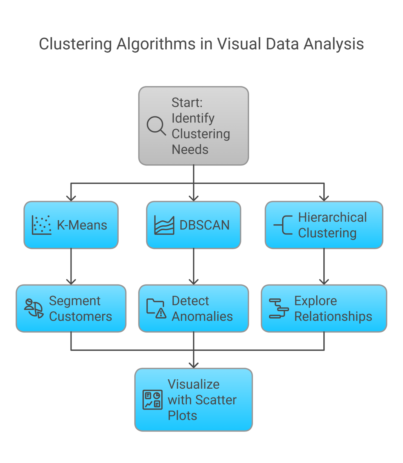
Clustering Techniques: Revealing Hidden Structures
Clustering algorithms are a class of unsupervised machine learning methods used to group data points into clusters based on their inherent similarities 12. These techniques are invaluable for visual data analysis as they can automatically discover natural groupings within the data, which can then be visualized to reveal underlying segments or categories.
K-Means: This popular centroid-based algorithm aims to partition the data into a pre-defined number of clusters (k) by iteratively assigning each data point to the cluster whose centroid (mean) it is closest to, and then updating the centroids based on the new cluster assignments 13. K-means is effective for identifying clusters that are roughly spherical in shape and of similar size. In visual data analysis, it can be used to segment customers in a scatter plot based on their purchasing behavior or to group similar images based on their visual features.
DBSCAN (Density-Based Spatial Clustering of Applications with Noise): Unlike K-means, DBSCAN is a density-based algorithm that groups together data points that are closely packed together, identifying clusters of arbitrary shapes and marking as outliers points that lie alone in low-density regions 12. This makes it particularly useful for anomaly detection in scatter plots or for identifying irregularly shaped clusters in visual data.
Hierarchical Clustering: This approach builds a hierarchy of clusters, represented by a dendrogram, either through an agglomerative (bottom-up) process where each data point starts in its own cluster and clusters are merged iteratively, or through a divisive (top-down) process where all data points start in one cluster which is then recursively split 12. Hierarchical clustering is valuable for exploring relationships between data points at different levels of granularity and can be visualized to show the hierarchical structure of the data.
Clustering algorithms provide a powerful way to automatically identify inherent groupings within datasets, which can then be effectively visualized using scatter plots, heatmaps, or other appropriate chart types. This enables analysts to uncover previously unknown segments, categories, or patterns in their data, leading to more profound insights and a better understanding of the underlying structures.
Classification Methods: Categorizing Visual Information:
Classification algorithms are supervised machine learning techniques that learn to assign data points to predefined categories or classes based on a set of input features 21. In visual data analysis, classification can be used to categorize visual elements or patterns based on underlying data characteristics, allowing for the visual encoding of complex categorical information.

Decision Trees: These tree-like models classify data by recursively partitioning the feature space based on a series of decision rules 26. Each path from the root to a leaf node represents a classification rule, and the leaf node itself represents the class label. Decision trees are highly interpretable and can handle both categorical and numerical data, making them useful for categorizing data in bar charts or identifying patterns in scatter plots.
Support Vector Machines (SVMs): SVMs aim to find the optimal hyperplane that best separates data points of different classes in a high-dimensional space 26. They are effective for both linear and non-linear classification tasks through the use of kernel functions, which can map data into higher-dimensional spaces to find a separating hyperplane. SVMs can be applied to classify images or to categorize data points in visualizations based on complex feature relationships.
Logistic Regression: Despite its name, logistic regression is a classification algorithm primarily used for binary classification problems. It models the probability of a binary outcome (e.g., yes/no, high/low) as a function of the input features using a sigmoid function 26. While primarily for binary outcomes, it can be extended to multi-class problems. In visual data analysis, logistic regression can be used to classify data points in visualizations into two distinct categories based on their underlying features.
Random Forests: This ensemble learning method builds multiple decision trees on different subsets of the data and features and then aggregates their predictions to make a final classification 26. Random forests often outperform single decision trees in terms of accuracy and robustness and can provide insights into the importance of different features in the classification process. They can be used to classify complex visual patterns or to categorize data in visualizations based on a multitude of factors.
Classification algorithms provide a powerful toolset for categorizing data points represented in visualizations, such as bars in a bar chart or points in a scatter plot. By learning from labeled data, these algorithms can predict or assign categories to new, unseen data, allowing for the visual encoding of complex categorical information and providing valuable insights into the underlying patterns and drivers of these classifications.
Dimensionality Reduction: Simplifying Complexity for Visualization
Dimensionality reduction techniques are essential for making high-dimensional data, which contains a large number of features, amenable to visualization in a two-dimensional or three-dimensional space 31. These methods transform the data into a lower-dimensional representation while attempting to preserve the most important information, thus simplifying the data structure for effective visualization.

Principal Component Analysis (PCA): PCA is a linear dimensionality reduction technique that identifies the principal components of the data, which are the directions in which the data varies the most 31. It projects the data onto a lower-dimensional subspace formed by the top principal components, effectively reducing the number of features while retaining the maximum variance. PCA is useful for noise reduction and for visualizing data with many correlated variables.
t-SNE (t-Distributed Stochastic Neighbor Embedding): t-SNE is a non-linear dimensionality reduction technique that is particularly well-suited for visualizing high-dimensional data in a low-dimensional space, typically two or three dimensions 18. It works by converting high-dimensional Euclidean distances between data points into conditional probabilities representing similarities and then aims to find a low-dimensional embedding of the points that preserves these similarities, often revealing clusters in the data.
UMAP (Uniform Manifold Approximation and Projection): UMAP is a more recent non-linear dimensionality reduction technique based on manifold learning and topological data analysis 31. It aims to preserve both the local and global structure of the data in a lower-dimensional embedding and is often faster and more scalable to large datasets compared to t-SNE. UMAP is increasingly becoming a preferred method for visualizing complex high-dimensional data, such as single-cell RNA sequencing data in bioinformatics.
Dimensionality reduction techniques are fundamental for enabling the visualization of complex, high-dimensional datasets. By projecting the data into a lower-dimensional space, these methods allow for the creation of scatter plots and other 2D/3D visualizations that can reveal underlying patterns, clusters, and relationships that would be obscured in the original high-dimensional representation.
Applications in Action: How ML Identifies Patterns in Visual Data
Machine learning algorithms are not merely theoretical tools; they have practical applications in enhancing data visualization by automatically identifying various patterns within visual data, leading to deeper insights and more informed decision-making.

Anomaly Detection: Spotting the Unexpected in Time Series
Machine learning offers powerful techniques for automatically detecting anomalies, or data points that deviate significantly from the expected behavior, in time series visualizations 46. These methods can learn complex temporal patterns and identify deviations that might indicate critical events.
Time Series Decomposition with Thresholding: One approach involves decomposing the time series into its constituent components—trend, seasonality, and residuals—using techniques like STL (Seasonal and Trend decomposition using Loess) 46. Anomalies can then be identified by setting a threshold on the residual component. Data points whose residuals exceed this threshold are flagged as unusual and can be visually highlighted in the time series plot, for example, by using a different color or adding an annotation. This method is effective for detecting deviations from the expected seasonal patterns or long-term trends.
ARIMA (Autoregressive Integrated Moving Average) Modeling: ARIMA models can be trained on historical time series data to predict future values 46. By comparing the actual observed values with the model's predictions, significant discrepancies can be identified as anomalies. In a time series visualization, the predicted values can be plotted alongside the actual values, with the anomalies clearly marked to show where the data deviates from the forecast. This is particularly useful for detecting unexpected spikes or drops in the data.
Autoencoders: These are a type of neural network trained to learn a compressed representation of normal data and then reconstruct the original input from this representation 46. When presented with anomalous data, the autoencoder's reconstruction will typically have a higher error. By visualizing the original and reconstructed time series, along with the reconstruction error, analysts can pinpoint the segments of the data that are most anomalous. This approach is effective for detecting subtle deviations from complex normal patterns.
Isolation Forest: This unsupervised learning algorithm works on the principle that anomalies are rare and different, making them easier to isolate 46. It builds random decision trees to partition the data, and anomalies are likely to be isolated in fewer splits. In the context of time series visualization, the isolation forest algorithm can assign an anomaly score to each data point. A scatter plot of these anomaly scores can then be used to visualize the degree of anomaly for each point, with a threshold applied to flag the most significant outliers.
Machine learning-driven anomaly detection provides a robust and automated way to identify unexpected events in time series visualizations, enabling proactive monitoring and timely intervention in applications ranging from fraud detection in financial data to predictive maintenance in industrial systems.
Cluster Identification: Grouping Similarities in Scatter Plots
Scatter plots are a fundamental tool for visualizing the relationship between two or more variables. Machine learning clustering algorithms can be applied to the data underlying these plots to automatically identify groups or segments of similar data points, revealing inherent structures that might not be immediately obvious through visual inspection alone 13.
K-Means for Customer Segmentation: When visualizing customer data in a scatter plot, with axes representing features like purchase frequency and total spending, the k-means algorithm can automatically partition the customers into distinct groups based on their similarity in these dimensions 18. These clusters can then be visually distinguished in the scatter plot by assigning different colors to the data points belonging to each cluster, providing a clear segmentation of the customer base.
DBSCAN for Identifying Core Groups and Outliers: In a scatter plot of sensor data, DBSCAN can identify densely populated regions as clusters, representing normal operational states, while marking sparsely populated points as noise or outliers 13. These outliers might indicate anomalous sensor readings or potential system failures, which can be visually highlighted in the scatter plot.
Hierarchical Clustering for Exploring Data Relationships: Applying hierarchical clustering to the data visualized in a scatter plot can reveal the relationships between data points at different levels of similarity 18. The results can be visualized as a dendrogram overlaid or linked with the scatter plot, allowing users to explore how clusters form and merge as the similarity threshold is varied. This can provide insights into the inherent hierarchical structure of the data.
By leveraging machine learning clustering algorithms, analysts can automatically discover meaningful groups within the data represented in scatter plots, facilitating a deeper understanding of the underlying patterns and relationships. This can be particularly valuable in exploratory data analysis, customer segmentation, and identifying anomalies or unusual data points.
Classification-Driven Insights: Categorizing Data in Bar Charts
Bar charts are commonly used to compare values across different categories. Machine learning classification algorithms can be employed to predict or categorize the entities represented by the bars based on multiple underlying features, allowing for the visual encoding of complex classification outcomes 26.
Decision Trees for Product Performance Prediction: In a bar chart showing the sales of various products, a decision tree classifier can be trained on a dataset that includes product features (such as price, category, marketing spend) and historical sales performance, labeled as "high-performing" or "low-performing" 26. The trained model can then predict the performance category for each product. This prediction can be visually integrated into the bar chart by coloring the bars according to the predicted performance level, providing an immediate visual assessment of which products are likely to succeed.
SVM for Sentiment-Based Categorization: Consider a bar chart displaying the average rating of different movies. An SVM classifier trained on movie reviews, labeled with sentiment (positive, negative, neutral), can be used to predict the sentiment associated with each movie based on its reviews 26. The bars in the chart representing the movies could then be colored or annotated to reflect the predominant sentiment predicted by the model, offering a visual insight into audience perception.
Logistic Regression for Risk Assessment: In a bar chart showing different loan applicants, a logistic regression model can be trained to predict the probability of loan default based on applicant features like credit score, income, and employment history 26. This risk assessment can be visually represented in the bar chart by coloring the bars according to the predicted risk level (e.g., a gradient from low-risk green to high-risk red), allowing loan officers to quickly identify applicants who might require closer scrutiny.
Integrating machine learning classification algorithms with bar charts enables the visual encoding of complex categorical predictions based on multiple underlying factors. This provides immediate and intuitive insights into the classification of different entities, enhancing the interpretability and actionability of the data presented in the visualization.
The Power of Integration: AI/ML Meets Python's Dash Library

Python's Dash library stands out as a highly effective framework for seamlessly integrating the analytical capabilities of AI and Machine Learning models with the creation of interactive data visualization applications 53. Built upon the foundations of Flask, Plotly.js, and React.js, Dash allows data scientists and analysts to develop sophisticated, web-based dashboards and visualizations using only Python, abstracting away the complexities of front-end web development 65.
One of Dash's key strengths is its exceptional compatibility with the rich ecosystem of Python data science libraries 53. Libraries such as scikit-learn, which provides a comprehensive suite of tools for implementing various ML algorithms, pandas, essential for efficient data manipulation and cleaning, and plotly, renowned for its ability to generate interactive and visually appealing charts and graphs, can all be readily incorporated into Dash applications.
The primary mechanism for bringing AI/ML models and Dash visualizations together is through the use of callbacks 61. Callbacks are essentially Python functions that are automatically executed whenever a specific property of an input component within the Dash application changes. This allows for the creation of dynamic and interactive dashboards where user actions, such as selecting an option from a dropdown menu or adjusting a slider, can trigger the execution of AI/ML models in the backend. The output of these models can then be used to update the properties of other components in the Dash app, such as the data displayed in a plotly graph or the text shown in a text box, all in real time.
Dash provides a robust and versatile platform for constructing end-to-end machine learning applications that feature highly interactive visualizations. It empowers data scientists to transform their trained ML models into user-friendly web interfaces, enabling a broader audience of stakeholders to engage with and derive insights from these models without requiring any coding expertise 73. The simplicity of building Dash apps, combined with the power of the underlying web technologies and the rich functionality of the integrated Python libraries, makes it an ideal choice for deploying AI/ML models in a visually compelling and interactive manner.
Building Interactive Visualizations: Implementing AI/ML in Dash Applications
Python's Dash library facilitates the creation of interactive visualizations that dynamically adapt based on insights derived from AI/ML models. This section explores several scenarios for implementing such integration within Dash applications.
Intelligent Chart Suggestions Driven by ML
Machine learning models can be trained to analyze the characteristics of a given dataset and intelligently suggest the most appropriate chart types for visualizing that data effectively 1. This can be particularly helpful for users who may not have a strong understanding of data visualization principles.
In a Dash application, this can be implemented by creating a callback that is triggered when a user uploads or selects their data. The callback function would then extract relevant features from the dataset, such as the number of variables, their data types, and statistical properties. These features would be fed into a pre-trained ML classification model, which would then predict the optimal chart type (e.g., line chart for time series, bar chart for categorical comparisons, scatter plot for correlations) 10. The Dash app can then use this prediction to render the suggested chart using plotly components. For example, if the model detects a time variable, it might suggest a line chart to show trends over time. If it identifies categorical data and numerical values, it might recommend a bar chart for easy comparison.
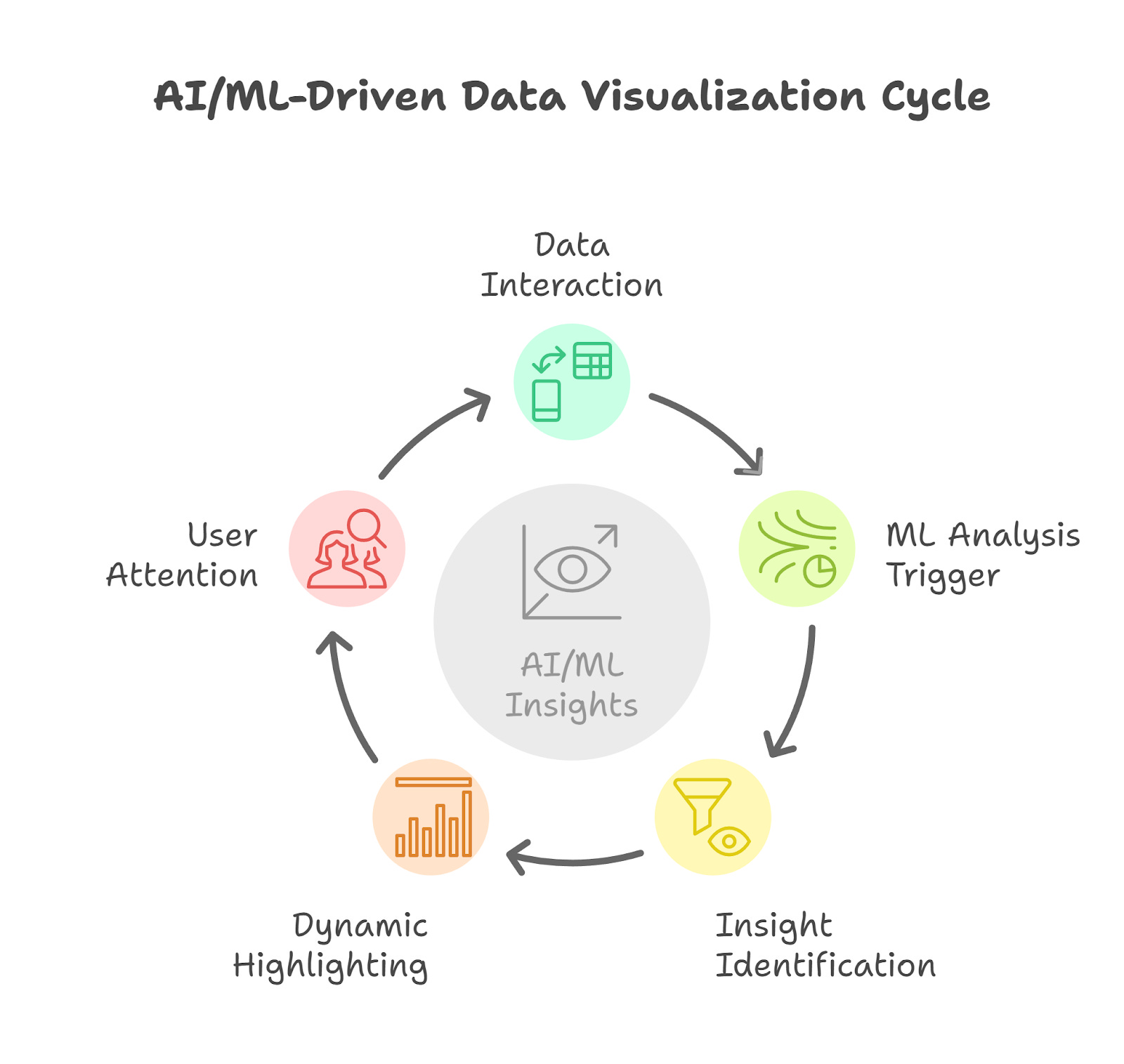
Dynamic Highlighting of Key Insights
AI/ML algorithms can be employed to automatically identify key insights within visualized data, such as significant trends, anomalies, or correlations, and dynamically highlight these insights within the visualization itself. This can draw the user's attention to the most important aspects of the data.
In a Dash application, a callback can be set up to trigger an ML analysis on the data displayed in a plotly chart whenever the data changes or the user interacts with the visualization (e.g., by zooming or filtering). For instance, an anomaly detection model could be run on a time series dataset to identify unusual data points 46. The callback function would then use the model's output (e.g., the indices of the anomalies) to update the appearance of the chart, perhaps by changing the color or size of the anomalous data points, or by adding annotations to flag them for the user. Similarly, ML models could identify segments of interest in a scatter plot based on clustering or classification results, and these segments could be highlighted using different colors or by drawing boundaries around them.
Predictive Visualization Capabilities
AI/ML models trained on historical data can be integrated into Dash applications to generate predictions about future trends or outcomes, providing users with a forward-looking perspective directly within their visualizations.
A Dash application can include input components, such as date range selectors or parameter sliders, that allow users to specify the time horizon or parameters for the prediction. A callback function can then take these inputs and feed them into a pre-trained ML model, such as a time series forecasting model (e.g., ARIMA or Holt-Winters) 77 or a classification model predicting future events. The predictions generated by the model can then be visualized within the Dash app, either as an extension of an existing chart (e.g., a forecast line extending a historical trend in a line chart) or as a separate predictive visualization. For example, a sales forecasting Dash app could allow users to select a future quarter, and an integrated forecasting model would then generate and display the predicted sales figures for that period on a line chart.
Automation Through Intelligence: AI's Role in Streamlining Data Visualization
AI plays a crucial role in automating various aspects of data visualization, leading to increased efficiency, speed, and accessibility.
Automated Chart Generation: Efficiency and Speed
AI algorithms are increasingly being used to automate the often time-intensive process of generating charts and graphs from raw data 1. These AI-powered tools analyze the characteristics of the input data, such as its structure, data types, and relationships between variables, and automatically select the most appropriate chart types to represent the data effectively. For instance, if the data contains temporal information, the AI might automatically generate a line chart to visualize trends over time. If it involves comparing categories, a bar chart might be chosen. This automation significantly reduces the manual effort required to create visualizations, allowing users to generate insights much more quickly.
In the context of Python's Dash library, while Dash itself requires explicit coding to create visualizations using plotly components, the process of intelligent chart selection could be automated by integrating with backend AI services or libraries. A Dash application could send the user's data to such an AI service, which would then analyze it and return a specification (e.g., in JSON format) defining the recommended chart type and its configuration. The Dash app would then use this specification to render the visualization using the appropriate plotly components. This approach streamlines the chart creation process, especially for users who may not be familiar with the nuances of different chart types and their suitability for various datasets.
Smart Recommendations for Data Representation
AI's capabilities extend beyond just suggesting chart types to providing more comprehensive and nuanced recommendations for how to best represent data visually 1. This includes offering advice on optimal color schemes, effective layout strategies, and the strategic use of interactive elements to enhance the clarity, impact, and user engagement of the visualizations.
AI algorithms can analyze various factors to generate these smart recommendations. They can consider the context of the data (e.g., financial, scientific, social), the intended audience (technical experts versus general users), and the specific insights the user is likely trying to communicate. Based on this analysis, the AI can suggest design choices that align with established best practices in data visualization. For example, it might recommend using a sequential color palette to highlight a trend, a diverging color scheme to emphasize deviations from a mean, or adding tooltips to a scatter plot to allow users to see the exact values of data points on hover.
Within a Dash application, an AI-powered recommendation engine could be implemented to analyze the user's data and the currently selected visualization. The engine could then provide contextual tips and suggestions for improvement, perhaps through interactive tooltips or a dedicated side panel within the application. This intelligent guidance can help users create more effective and user-friendly data visualizations, even if they lack deep expertise in visual design principles.
Natural Language Interfaces: Interacting with Visualizations Intuitively
AI enables the development of Natural Language Interfaces (NLIs) that allow users to interact with data visualization tools and dashboards using plain, everyday language 1. This offers a more intuitive and accessible way for users to explore and gain insights from their data, as it eliminates the need to learn specific commands or navigate complex menus that are often associated with traditional data analysis software.
Through an NLI, users can ask questions about their data in a conversational manner, such as "Show me the average sales by region for the last quarter" or "What are the top 10 products by revenue?" The AI system then processes these natural language queries, translates them into the appropriate actions within the visualization tool (e.g., filtering data, selecting specific chart types, applying aggregations), and updates the visualization accordingly 10.
Dash applications can be integrated with various Natural Language Processing (NLP) libraries (e.g., spaCy, NLTK in Python) or connected to cloud-based NLP services (e.g., Google Cloud Natural Language, Amazon Comprehend) to build NLIs. A Dash app could feature a text input field where users can type their data-related questions. A callback function would then send this query to the NLP engine, which would parse the query and return instructions on how to manipulate the data and update the visualization in the Dash app to answer the user's question. This conversational approach to data exploration can significantly enhance the usability of data visualization platforms, making them accessible to a wider audience, including individuals who may not have a strong technical background in data analysis.
Elevating User Experience: AI for Enhanced UI/UX in Data Visualization Platforms
Artificial Intelligence plays a significant role in enhancing the user interface (UI) and user experience (UX) of data visualization platforms, making them more intuitive, efficient, and tailored to individual user needs.
Personalized Dashboard Experiences
AI and Machine Learning can be leveraged to create highly personalized data visualization dashboard experiences based on an individual user's role, preferences, and historical interactions with the platform 1. By analyzing user behavior, such as the types of visualizations they frequently view, the specific metrics they monitor, and the filters they apply, AI algorithms can learn which data and insights are most relevant to each user 2.
This information can then be used to dynamically customize the dashboard layout and content. For example, a sales manager might be automatically presented with a dashboard that prioritizes key sales performance indicators (KPIs), visualizations of customer acquisition trends, and regional sales breakdowns, as these are likely to be the metrics most critical to their role. In contrast, a marketing analyst's dashboard might be customized to highlight campaign performance metrics, website traffic analysis, and customer engagement data.
Dash applications can implement user authentication and profile management systems to track individual user preferences and usage patterns. AI algorithms can then process this data to tailor the dashboard view upon login, ensuring that each user is presented with a personalized and efficient interface that provides immediate access to the information they need. This level of personalization can significantly improve user satisfaction and productivity by reducing the time spent searching for relevant data and focusing on the insights that matter most to their specific responsibilities.
Intelligent Assistance for Seamless Data Exploration
AI can act as an intelligent assistant within data visualization platforms, providing users with proactive guidance and support throughout their data exploration journey 1. This assistance can take various forms, such as suggesting relevant data views, highlighting potential insights that the user might have overlooked, and recommending logical next steps for further analysis.
AI-powered tools can analyze the user's current view of the data, as well as the overall dataset, to identify related visualizations or analyses that could provide additional context or uncover deeper insights 2. For example, if a user is viewing a bar chart showing sales by product category, the AI assistant might suggest viewing a time series of sales for the top-performing category to analyze its trend over time, or it might recommend exploring the correlation between sales and customer reviews for those products.
Natural language interfaces can also function as intelligent assistants, allowing users to ask for guidance or specific analyses in plain language. For instance, a user might type "What are the key drivers of customer churn in the last quarter?" and the AI assistant would not only generate the relevant visualization but also provide a textual summary of the key factors identified.
In a Dash application, this type of intelligent assistance can be implemented through interactive components such as chatbots or suggestion panels that are contextually aware of the user's current interaction with the dashboard and the data being displayed. By proactively offering relevant suggestions and guidance, AI can make the data exploration process more intuitive, efficient, and ultimately more insightful, particularly for users who may be less experienced with advanced data analysis techniques.
Navigating the Challenges: Ethical Considerations in AI-Enhanced Data Visualization
The integration of AI and ML into data visualization, while offering numerous benefits, also introduces several ethical considerations that must be carefully addressed to ensure responsible and trustworthy use of these technologies.
Addressing Bias in AI Algorithms
One of the most significant ethical concerns is the potential for bias in AI/ML algorithms to influence the data and its visual representation 105. AI/ML models learn from historical data, and if this data contains biases—whether due to underrepresentation of certain groups, flawed data collection methods, or societal prejudices—the algorithms can perpetuate and even amplify these biases in the resulting visualizations. For example, a model trained predominantly on data from one demographic group might not accurately represent or might even misrepresent data from other groups, leading to unfair or discriminatory visual insights.
To mitigate this risk, it is crucial to prioritize the use of diverse and representative datasets for training AI/ML models 105. Employing bias detection techniques to identify and quantify bias in both the data and the trained models is also essential. Furthermore, developing and implementing bias mitigation strategies, such as re-weighting data or using fairness-aware algorithms, can help reduce the potential for discriminatory outcomes 105. Transparency in the AI development process, including documenting the data sources and any bias detection and mitigation steps taken, is also vital. Ongoing monitoring of model performance across different subgroups is necessary to ensure that the AI-driven visualizations are fair and equitable.
Preventing Misinterpretation of AI-Driven Visual Insights
While AI can provide valuable and often complex insights, there is a significant risk that users might misinterpret the visualizations generated by these systems, especially if the underlying algorithms or the nuances of the data are not well understood 122. The complexity of some AI/ML models can make it challenging for users to grasp the reasoning behind the patterns or predictions presented in the visualizations, potentially leading to incorrect conclusions or a lack of trust in the insights.
To address this, ensuring transparency about how AI models work is paramount 105. Providing clear and concise labels, annotations, and sufficient contextual information within the visualizations is essential to guide user interpretation and prevent misleading conclusions 143. Where possible, using interpretable AI models or providing explanations of the model's behavior, such as highlighting the most influential features, can enhance user understanding. Natural language generation can also play a role by providing textual summaries and interpretations of AI-driven insights directly within the visualization platform.
Data Privacy and Security Implications
The integration of AI/ML with data visualization often involves the processing of large datasets, which may include sensitive or personal information, thus raising significant concerns about data privacy and security 105. It is crucial to ensure that this data is handled ethically, securely, and in compliance with relevant privacy regulations. AI models themselves may also be vulnerable to security threats or may inadvertently reveal sensitive information through their outputs.
Implementing robust data security measures, such as encryption both in transit and at rest, and enforcing strict access controls are essential to prevent unauthorized access and data breaches 105. Employing data anonymization techniques, where personally identifiable information is removed or altered, can further protect individual privacy. Organizations must also adhere to data privacy regulations, such as GDPR and CCPA, which dictate how personal data should be collected, processed, stored, and used. Transparency with users about how their data is being used in AI-driven visualizations is also crucial for building and maintaining trust.
Ensuring Transparency and Explainability
Transparency in AI refers to the ability of users to understand how AI systems make decisions and why they produce specific results 105. Explainable AI (XAI) is a related field that focuses on developing methods and techniques to make the reasoning behind AI decisions more understandable to humans. In the context of data visualization, both transparency and explainability are crucial for building user trust in AI-driven insights and ensuring accountability.
One approach to improving transparency is to favor the use of interpretable AI models, such as decision trees or linear regression, over more complex "black box" models like deep neural networks, especially when the interpretability of the insights is paramount. For more complex models, techniques like visualizing feature importance, which shows the relative influence of different input variables on the model's output, can provide some level of explanation. Additionally, natural language explanations of AI-generated insights can help users understand the key takeaways from a visualization without needing to delve into the technical details of the underlying AI model. Integrating these transparency and explainability features directly into data visualization platforms can significantly enhance user trust and facilitate the responsible adoption of AI-enhanced visual analytics.
Conclusion: The Future of Data Visualization Empowered by AI/ML
The integration of Artificial Intelligence and Machine Learning into the realm of data visualization marks a transformative era in how we interact with and understand data. AI/ML technologies are not just augmenting traditional visualization methods; they are enabling entirely new possibilities for automation, personalization, and the generation of deeper, more actionable insights.
Python's Dash library serves as a powerful catalyst in this transformation, providing a flexible and accessible platform for data scientists and analysts to build interactive and intelligent visual analytics applications. The seamless integration of Dash with the rich ecosystem of Python's data science libraries, including those for implementing sophisticated AI/ML models, empowers developers to create applications that go far beyond static charts and dashboards, offering dynamic, user-driven experiences.
However, the path forward must be navigated with careful consideration of the ethical implications that arise with the increasing use of AI. Addressing biases in algorithms, ensuring the interpretability of AI-driven insights, safeguarding the privacy and security of data, and prioritizing transparency in AI processes are not just best practices but fundamental requirements for building trust and ensuring the responsible adoption of these powerful technologies.
The future of data visualization, empowered by AI and ML, promises to be increasingly intelligent, intuitive, and impactful. We can anticipate further advancements in automated chart generation, smarter recommendations for data representation that are tailored to specific contexts and audiences, and more natural and conversational interactions with data through natural language interfaces. The focus will likely continue to shift towards creating personalized and adaptive visualization platforms that proactively assist users in their data exploration journey, ultimately leading to a more profound and widespread understanding of the complex data that shapes our world.
Tables
Table 2
References :
1. AI-driven Insights: How Artificial Intelligence Is Shaping Data Visualization - Florida Gulf Coast University (FGCU), accessed on March 20, 2025, https://onlinedegree.fgcu.edu/programs/mba-data-analytics/artificial-intelligence-insights/
2. How to Use AI in Data Visualization? - MachEye, accessed on March 20, 2025, https://www.macheye.com/blog/how-to-use-ai-in-data-visualization/
3. How AI is Revolutionizing Data Visualization Techniques for Enhanced Insights, accessed on March 20, 2025, https://xchange.avixa.org/posts/how-ai-is-revolutionizing-data-visualization-techniques-for-enhanced-insights
4. The Rise of AI in Advancing Data Visualization, accessed on March 20, 2025, https://www.dasca.org/world-of-data-science/article/the-rise-of-ai-in-advancing-data-visualization
5. Data Visualization for 2024 & Beyond: The Role of AI in its Future | The Virtual Forge, accessed on March 20, 2025, https://www.thevirtualforge.com/company/blog/data-visualization-for-2024-beyond-the-role-of-ai-in-its-future
6. The Role of Machine Learning in Data Analysis: Key Benefits and ..., accessed on March 20, 2025, https://www.ironhack.com/us/blog/the-role-of-machine-learning-in-data-analysis
7. How can AI help with data visualization? - insightsoftware, accessed on March 20, 2025, https://insightsoftware.com/blog/how-can-ai-help-with-data-visualization/
8. The Role of Machine Learning and Data Visualization in AI - upGrad, accessed on March 20, 2025, https://www.upgrad.com/blog/ml-and-data-visualization-for-data-predictions/
9. AI ML DS - How To Get Started? - GeeksforGeeks, accessed on March 20, 2025, https://www.geeksforgeeks.org/ai-ml-ds/
10. How To Use AI for Data Visualizations and Dashboards | GoodData, accessed on March 20, 2025, https://www.gooddata.com/blog/how-to-use-ai-for-data-visualizations-and-dashboards/
11. AI for Data Analysis and Visualization | Teradata, accessed on March 20, 2025, https://www.teradata.com/insights/ai-and-machine-learning/ai-for-data-analysis-and-visualization
12. Exploring Clustering Algorithms: Explanation and Use Cases, accessed on March 20, 2025, https://neptune.ai/blog/clustering-algorithms
13. Cluster analysis: What it is, types, & how to apply the technique ..., accessed on March 20, 2025, https://www.knime.com/blog/what-is-clustering-how-does-it-work
14. Cluster analysis - Wikipedia, accessed on March 20, 2025, https://en.wikipedia.org/wiki/Cluster_analysis
15. Clustering Visualization: The Ultimate Guide to Get Started - Kanaries Docs, accessed on March 20, 2025, https://docs.kanaries.net/articles/clustering-visualization
16. Mastering Clustering Algorithms for Effective Data Analysis | ml-articles – Weights & Biases, accessed on March 20, 2025, https://wandb.ai/mostafaibrahim17/ml-articles/reports/Mastering-Clustering-Algorithms-for-Effective-Data-Analysis--Vmlldzo0ODk5NzAw
17. 10 Clustering Algorithms With Python - MachineLearningMastery.com, accessed on March 20, 2025, https://machinelearningmastery.com/clustering-algorithms-with-python/
18. Visualizing Data Using K-Means Clustering Unsupervised Machine Learning - Medium, accessed on March 20, 2025, https://medium.com/@jwbtmf/visualizing-data-using-k-means-clustering-unsupervised-machine-learning-8b59eabfcd3d
19. K means Clustering - Introduction - GeeksforGeeks, accessed on March 20, 2025, https://www.geeksforgeeks.org/k-means-clustering-introduction/
20. Cluster Analysis in Machine Learning: A Case Study | Medium, accessed on March 20, 2025, https://medium.com/@adeleke.joe/clustering-analysis-in-machine-learning-a-case-study-cf72a7b69096
21. Pattern Recognition and Machine Learning: 2025 Industry ..., accessed on March 20, 2025, https://labelyourdata.com/articles/pattern-recognition-in-machine-learning
22. Machine Learning Pattern Recognition: A Beginner's Guide - Codewave, accessed on March 20, 2025, https://codewave.com/insights/pattern-recognition-machine-learning/
23. Machine Learning & Pattern Recognition: A Powerful Combo - Labellerr, accessed on March 20, 2025, https://www.labellerr.com/blog/machine-learning-and-pattern-recognition-a-powerful-combination/
24. Pattern Recognition in Machine Learning [2025 Guide] - Analytics Vidhya, accessed on March 20, 2025, https://www.analyticsvidhya.com/blog/2023/02/a-complete-manual-to-pattern-recognition-in-machine-learning/
25. Pattern Recognition | Introduction - GeeksforGeeks, accessed on March 20, 2025, https://www.geeksforgeeks.org/pattern-recognition-introduction/
26. Top Machine Learning Algorithms for Classification - Visual Design, accessed on March 20, 2025, https://www.visual-design.net/post/top-machine-learning-algorithms-classification
27. How to Visualize Classification Data: Best Practices - Levity.ai, accessed on March 20, 2025, https://levity.ai/blog/visualize-classification-data
28. Getting started with Classification - GeeksforGeeks, accessed on March 20, 2025, https://www.geeksforgeeks.org/getting-started-with-classification/
29. Classification in Machine Learning: A Guide for Beginners - DataCamp, accessed on March 20, 2025, https://www.datacamp.com/blog/classification-machine-learning
30. Chart Classification Using Siamese CNN - MDPI, accessed on March 20, 2025, https://www.mdpi.com/2313-433X/7/11/220
31. Visualizing Data with Dimensionality Reduction Techniques ..., accessed on March 20, 2025, https://docs.voxel51.com/tutorials/dimension_reduction.html
32. How to Visualize Your Data with Dimension Reduction Techniques | by Jacob Marks, Ph.D., accessed on March 20, 2025, https://medium.com/voxel51/how-to-visualize-your-data-with-dimension-reduction-techniques-ae04454caf5a
33. Introduction to Dimensionality Reduction - GeeksforGeeks, accessed on March 20, 2025, https://www.geeksforgeeks.org/dimensionality-reduction/
34. Top 12 Dimensionality Reduction Techniques for Machine Learning - Encord, accessed on March 20, 2025, https://encord.com/blog/dimentionality-reduction-techniques-machine-learning/
35. Understanding Dimensionality Reduction Techniques for Enhanced Data Analysis, accessed on March 20, 2025, https://www.numberanalytics.com/blog/dimensionality-reduction-techniques-enhanced-data-analysis
36. t-SNE Mastery: 7 Key Insights for Data Visualization, accessed on March 20, 2025, https://www.numberanalytics.com/blog/tsne-mastery-7-key-insights-data-visualization
37. The t-SNE Data Visualization Technique from Scratch Using C# -- Visual Studio Magazine, accessed on March 20, 2025, https://visualstudiomagazine.com/Articles/2024/03/15/t-sne-data-visualization.aspx
38. Using T-SNE in Python to Visualize High-Dimensional Data Sets | Built In, accessed on March 20, 2025, https://builtin.com/data-science/tsne-python
39. Is t-SNE just for visualization? - Data Science Stack Exchange, accessed on March 20, 2025, https://datascience.stackexchange.com/questions/13083/is-t-sne-just-for-visualization
40. t-distributed stochastic neighbor embedding - Wikipedia, accessed on March 20, 2025, https://en.wikipedia.org/wiki/T-distributed_stochastic_neighbor_embedding
41. What is a UMAP plot? - Single Cell Discoveries, accessed on March 20, 2025, https://www.scdiscoveries.com/blog/knowledge/what-is-a-umap-plot/
42. Mastering UMAP for Effective High-Dimensional Data Visualization Methods, accessed on March 20, 2025, https://www.numberanalytics.com/blog/mastering-umap-high-dimensional-data-visualization-methods
43. 7 Ways UMAP Revolutionizes Data Visualization in 2023 - Number Analytics, accessed on March 20, 2025, https://www.numberanalytics.com/blog/7-ways-umap-revolutionizes-data-visualization-2023
44. UMAP: Uniform Manifold Approximation and Projection for Dimension Reduction — umap 0.5.8 documentation, accessed on March 20, 2025,
https://umap-learn.readthedocs.io/
45. Exploratory Analysis of Interesting Datasets — umap 0.5.8 documentation, accessed on March 20, 2025, https://umap-learn.readthedocs.io/en/latest/exploratory_analysis.html
46. Using Machine Learning for Time Series Anomaly Detection, accessed on March 20, 2025, https://www.anomalo.com/blog/machine-learning-approaches-to-time-series-anomaly-detection/
47. Azure Machine Learning Time Series Analysis for Anomaly Detection, accessed on March 20, 2025, https://learn.microsoft.com/en-us/archive/msdn-magazine/2017/november/machine-learning-azure-machine-learning-time-series-analysis-for-anomaly-detection
48. Mastering Anomaly Detection in Time Series Data: Techniques and Insights - Medium, accessed on March 20, 2025, https://medium.com/@ketan31kumar/mastering-anomaly-detection-in-time-series-data-techniques-and-insights-98fbe94c4258
49. Time Series Anomaly Detection Using Deep Learning - MathWorks, accessed on March 20, 2025, https://www.mathworks.com/help/deeplearning/ug/time-series-anomaly-detection-using-deep-learning.html
50. Anomaly Detection in Time Series | The PyCharm Blog, accessed on March 20, 2025, https://blog.jetbrains.com/pycharm/2025/01/anomaly-detection-in-time-series/
51. It's Time to Use AI and Machine Learning Like Bar Charts. | Towards ..., accessed on March 20, 2025, https://towardsdatascience.com/its-time-to-use-ai-and-machine-learning-like-bar-charts-a21caf6ebcfa/
52. Bar Plot in Matplotlib - GeeksforGeeks, accessed on March 20, 2025, https://www.geeksforgeeks.org/bar-plot-in-matplotlib/
53. Build a Data in Python with Streamlit Dashboard - Analytics Vidhya, accessed on March 20, 2025, https://www.analyticsvidhya.com/blog/2020/10/create-interactive-dashboards-with-streamlit-and-python/
54. Building a dashboard in Python using Streamlit - Streamlit Blog, accessed on March 20, 2025, https://blog.streamlit.io/crafting-a-dashboard-app-in-python-using-streamlit/
55. Creating a Real-Time Live Dashboard in Python Using Streamlit: Examples and Guide, accessed on March 20, 2025, https://getlazy.ai/post/real-time-dashboard-python-streamlit
56. Data Storytelling 101: 5 Tips to Structure Your Data Stories - Gramener Blog, accessed on March 20, 2025, https://blog.gramener.com/data-storytelling-tips-to-structure-data-stories/
57. Creating Interactive Data Dashboards with Plotly and Dash | Code by Zeba Academy, accessed on March 20, 2025, https://code.zeba.academy/interactive-data-dashboards-plotly-dash/
58. Creating Interactive Dashboards with Plotly and Dash | by Kapil Khatik - Medium, accessed on March 20, 2025, https://medium.com/@kapildevkhatik2/creating-interactive-dashboards-with-plotly-and-dash-bd15babe364d
59. Visualizing Quantitative Data: Best Practices - Ajelix, accessed on March 20, 2025, https://ajelix.com/data/visualizing-quantitative-data-best-practices/
60. Data Visualization UI/UX Design Services - Flatirons Development, accessed on March 20, 2025, https://flatirons.com/services/data-visualization-ui-ux-design/
61. Deploy Machine Learning Model Using Python Dash and Pipenv | Towards Data Science, accessed on March 20, 2025, https://towardsdatascience.com/deploy-machine-learning-model-using-dash-and-pipenv-c543569c33a6/
62. Dash : Python Framework for Machine Learning, AI and Web Analytics - YouTube, accessed on March 20, 2025,
63. Build Python Web Apps for scikit-learn Models with Plotly Dash, accessed on March 20, 2025, https://plotly.com/blog/build-python-web-apps-for-scikit-learn-with-plotly-dash/
64. Visualization through Dash for an end-to-end Machine Learning ..., accessed on March 20, 2025, https://medium.com/@kumarkaushal.bit/visualization-through-dash-for-an-end-to-end-machine-learning-project-d22ec981bf13
65. Develop Data Visualization Interfaces in Python With Dash - Real Python, accessed on March 20, 2025, https://realpython.com/python-dash/
66. Creating Web Apps for Your Machine Learning Models with Dash - Atmosera, accessed on March 20, 2025, https://www.atmosera.com/blog/creating-web-apps-machine-learning-models-dash/
67. Effective ML Workflows. Integrating Dash Enterprise within the… | by Elliot Gunn | Plotly, accessed on March 20, 2025, https://medium.com/plotly/effective-ml-workflows-5af03657a171
68. Creating a Simple Interactive Dashboard with Dash | by Sekar Wibowo - Medium, accessed on March 20, 2025, https://medium.com/@sekarsw/creating-a-simple-interactive-dashboard-with-dash-6c8ac1ec1a09
69. Advanced Callbacks | Dash for Python Documentation | Plotly, accessed on March 20, 2025, https://dash.plotly.com/advanced-callbacks
70. Introduction to Dash Plotly - Data Visualization in Python - YouTube, accessed on March 20, 2025,
71. Plotly Dash Tutorial - Interactive Python Web App Development - YouTube, accessed on March 20, 2025,
72. Adding Interactivity with Dash Callbacks | CodeSignal Learn, accessed on March 20, 2025, https://codesignal.com/learn/courses/dashing-through-dash/lessons/adding-interactivity-with-dash-callbacks
73. How To Deploy Machine Learning Models to the Web - Seattle Data Guy, accessed on March 20, 2025, https://www.theseattledataguy.com/how-to-deploy-machine-learning-models-to-the-web/
74. The Best 11 AI Chart Generators for Professionals in 2025 - PageOn.ai, accessed on March 20, 2025, https://www.pageon.ai/blog/ai-chart-generators
75. Free AI Graph Generator - Piktochart, accessed on March 20, 2025, https://piktochart.com/ai-graph-generator/
76. Free AI Chart Generator - Make Charts in Seconds - Venngage, accessed on March 20, 2025, https://venngage.com/ai-tools/chart
77. Time series forecasting: 2025 complete guide | InfluxData, accessed on March 20, 2025, https://www.influxdata.com/time-series-forecasting-methods/
78. ARIMA Forecasting - The Information Lab Nederland, accessed on March 20, 2025, https://www.theinformationlab.nl/2023/03/30/arima-time-series-forecasting/
79. ARIMA for Time Series Forecasting: A Complete Guide - DataCamp, accessed on March 20, 2025, https://www.datacamp.com/tutorial/arima
80. Holt's Winters Exponential Smoothing (Additive and Multiplicative) - John Galt Solutions, accessed on March 20, 2025, https://johngalt.com/forecasting-methods/holts-winters-exponential-smoothing
81. Time series Forecasting - Holt's method - Data Science Prophet, accessed on March 20, 2025, https://www.datascienceprophet.com/time-series-forecasting-holts-method/
82. Holt Winter's Method for Time Series Analysis - Analytics Vidhya, accessed on March 20, 2025, https://www.analyticsvidhya.com/blog/2021/08/holt-winters-method-for-time-series-analysis/
83. What is Time Series Forecasting? - datakulture, accessed on March 20, 2025, https://datakulture.com/blog/a-deep-dive-into-time-series-forecasting-techniques/
84. Holt's Double Exponential Smoothing - John Galt Solutions, accessed on March 20, 2025, https://johngalt.com/forecasting-methods/holts-double-exponential-smoothing
85. orangematter.solarwinds.com, accessed on March 20, 2025, https://orangematter.solarwinds.com/2019/12/15/holt-winters-forecasting-simplified/#:~:text=The%20Holt%2DWinters%20method%20uses,%E2%80%9Csmooth%E2%80%9D%20a%20time%20series.
86. Free AI Graph Maker - Generate Interactive Chart in Seconds, accessed on March 20, 2025,
https://aigraphmaker.net/
87. 15 Best AI Tools for Data Analysis and Visualization | by Muhammad Subhan | Medium, accessed on March 20, 2025, https://medium.com/@msubhanshoaib/15-best-ai-tools-for-data-analysis-and-visualization-addfa3ab0d13
88. The 5 Best AI Tools for Data Visualization in 2025 - Dhruvir Zala, accessed on March 20, 2025, https://dhruvirzala.com/ai-tools-for-data-visualization/
89. AI Data Visualization Tools: Unlocking Success - Decision Foundry, accessed on March 20, 2025, https://www.decisionfoundry.com/data/articles/ai-data-visualization-tools-unlocking-success/
90. Top 5 AI Tools for Data Visualization to Consider in 2025 - ThoughtSpot, accessed on March 20, 2025, https://www.thoughtspot.com/data-trends/ai/ai-tools-for-data-visualization
91. Natural Language Interface for Data Analytics - Microsoft Research, accessed on March 20, 2025, https://www.microsoft.com/en-us/research/project/conversational-data-analytics/
92. Automated Data Visualization from Natural Language via Large Language Models: An Exploratory Study - arXiv, accessed on March 20, 2025, https://arxiv.org/html/2404.17136v1
93. Natural Language Interfaces for Tabular Data Querying and Visualization: A Survey, accessed on March 20, 2025, https://www.computer.org/csdl/journal/tk/2024/11/10530359/1WWdVpae7FC
94. NL4DV | Home, accessed on March 20, 2025,
https://nl4dv.github.io/
95. NL4DV: Toolkit for Natural Language Driven Data Visualization, accessed on March 20, 2025, https://faculty.cc.gatech.edu/~stasko/papers/infovis16-poster-nl4dv.pdf
96. AI-Powered Dashboards: The Future of Data Visualization and BI., accessed on March 20, 2025, https://www.usedatabrain.com/blog/ai-powered-dashboard
97. Build Data Visualization Dashboards with AI - Lovable, accessed on March 20, 2025, https://lovable.dev/solutions/use-case/dashboard-data-visualization-dashboards
98. AI-Generated Dashboards & Data Visualization - Polymer Search, accessed on March 20, 2025, https://www.polymersearch.com/ai-dashboard-generator
99. Automating Data Analysis with Artificial Intelligence - Pecan AI, accessed on March 20, 2025, https://www.pecan.ai/blog/automating-data-analysis-with-artificial-intelligence/
100. Llegan a la estación espacial los reemplazos de 2 astronautas varados desde junio - AP News, accessed on March 20, 2025, https://apnews.com/article/spacex-estacion-espacial-astronautas-varados-nasa-7d6594b21ffde89dcf224220f386ed98
101. Top 9 AI tools for Data Analysis in 2025 | Domo, accessed on March 20, 2025, https://www.domo.com/learn/article/ai-data-analysis-tools
102. AI for Data Analytics | Google Cloud, accessed on March 20, 2025, https://cloud.google.com/use-cases/ai-data-analytics
103. AmpAI — Data Exploration and Productivity AI - Amperity, accessed on March 20, 2025, https://amperity.com/platform/ai
104. Top 7 AI Tools for Data Analysis: Ultimate Guide, accessed on March 20, 2025, https://julius.ai/articles/top-7-ai-tools-for-data-analysis-ultimate-guide
105. Ethical Considerations in AI & Machine Learning - Intelegain, accessed on March 20, 2025, https://www.intelegain.com/ethical-considerations-in-ai-machine-learning/
106. The Importance of Ethics in Machine Learning - Censius, accessed on March 20, 2025, https://censius.ai/blogs/the-importance-of-ethics-in-machine-learning
107. Top 10 Ethical Considerations for AI Projects | PMI Blog, accessed on March 20, 2025, https://www.pmi.org/blog/top-10-ethical-considerations-for-ai-projects
108. The ethics of artificial intelligence (AI) - Tableau, accessed on March 20, 2025, https://www.tableau.com/data-insights/ai/ethics
109. What is AI Ethics? | IBM, accessed on March 20, 2025, https://www.ibm.com/think/topics/ai-ethics
110. Seven Types Of Data Bias In Machine Learning | TELUS Digital, accessed on March 20, 2025, https://www.telusdigital.com/insights/ai-data/article/7-types-of-data-bias-in-machine-learning
111. Fairness and Bias in Artificial Intelligence: A Brief Survey of Sources, Impacts, and Mitigation Strategies - MDPI, accessed on March 20, 2025, https://www.mdpi.com/2413-4155/6/1/3
112. Bias in artificial intelligence for medical imaging: fundamentals, detection, avoidance, mitigation, challenges, ethics, and prospects - Diagnostic and Interventional Radiology, accessed on March 20, 2025, https://www.dirjournal.org/articles/bias-in-artificial-intelligence-for-medical-imaging-fundamentals-detection-avoidance-mitigation-challenges-ethics-and-prospects/doi/dir.2024.242854
113. AI Bias Examples | IBM, accessed on March 20, 2025, https://www.ibm.com/think/topics/shedding-light-on-ai-bias-with-real-world-examples
114. Considering the Potential Impact of Data Bias on AI/ML and the Medical Device Ecosystem, accessed on March 20, 2025, https://pmc.ncbi.nlm.nih.gov/articles/PMC10508867/
115. 6 Ethical Considerations in AI Powered Visual Recognition - Flexible Vision, accessed on March 20, 2025, https://www.flexiblevision.com/blog/ethical-considerations-ai-powered-visual-recognition/
116. Ethics in Data Visualization: Representing Information Responsibly - Alibaba Cloud, accessed on March 20, 2025, https://www.alibabacloud.com/tech-news/a/data_visualization/4oebeafy57v-ethics-in-data-visualization-representing-information-responsibly
117. AI Ethics - Applied Data Sciences - Guides at Penn Libraries, accessed on March 20, 2025, https://guides.library.upenn.edu/c.php?g=1327231&p=9810298
118. AI and Data Privacy: Navigating Challenges of Data Security in AI - InData Labs, accessed on March 20, 2025, https://indatalabs.com/blog/data-privacy-and-ai-models
119. The growing data privacy concerns with AI: What you need to know - DataGuard, accessed on March 20, 2025, https://www.dataguard.com/blog/growing-data-privacy-concerns-ai/
120. What is AI transparency? A comprehensive guide - Zendesk, accessed on March 20, 2025, https://www.zendesk.com/blog/ai-transparency/
121. AI and Data Privacy | Osano, accessed on March 20, 2025, https://www.osano.com/articles/ai-and-data-privacy
122. www.dataversity.net, accessed on March 20, 2025, https://www.dataversity.net/data-visualization-in-the-era-of-ai-ml/#:~:text=The%20challenge%20is%20always%20the,manually%20within%20the%20visualization%20tools.
123. AI in data visualization: Benefits, challenges and more, accessed on March 20, 2025, https://saxon.ai/blogs/ai-in-data-visualization-everything-you-should-know/
124. Generative AI for Visualization: Opportunities and Challenges - IEEE Computer Society, accessed on March 20, 2025, https://www.computer.org/csdl/magazine/cg/2024/02/10478355/1VBAA66c7Uk
125. Data Visualization in the Era of AI/ML - DATAVERSITY, accessed on March 20, 2025, https://www.dataversity.net/data-visualization-in-the-era-of-ai-ml/
126. Artificial Intelligence in Data Visualization: Ethics and Trends for 2024 - DZone, accessed on March 20, 2025, https://dzone.com/articles/artificial-intelligence-in-data-visualization
127. Build a Python Interactive Data Dashboard with Dash & Plotly - YouTube, accessed on March 20, 2025,
128. The manifesto of the data-ink ratio - Liquid, accessed on March 20, 2025, https://blog.liquidinteractive.com.au/the-manifesto-of-the-data-ink-ratio
129. Ethical data visualization: best practices for marketers - Funnel, accessed on March 20, 2025, https://funnel.io/blog/ethical-data-visualization-marketing-best-practices
130. Ethics of Data Visualization: Avoiding Deceptive Practices - Analytico, accessed on March 20, 2025, https://www.analyticodigital.com/blog/ethics-of-data-visualization-avoiding-deceptive-practices
131. Misleading Data Visualization - What to Avoid - Coupler.io Blog, accessed on March 20, 2025, https://blog.coupler.io/misleading-data-visualization-examples/
132. 10 Ways to Mislead with Data Visualization - PolicyViz, accessed on March 20, 2025, https://policyviz.com/2023/02/07/10-ways-to-mislead-with-data-visualization/
133. 10 Common Data Visualization Mistakes and How to Avoid Them | by Agoda Engineering, accessed on March 20, 2025, https://medium.com/agoda-engineering/10-common-data-visualization-mistakes-and-how-to-avoid-them-e3896fe8e104
134. Best and Worst Data Visualizations Examples | Vizzu, accessed on March 20, 2025, https://www.vizzu.io/blog/data-visualization-examples
135. 10 Data Visualization Best Practices to Overcome Common Mistakes - Golden Software, accessed on March 20, 2025, https://www.goldensoftware.com/data-visualization-best-practices/
136. Misleading Data Visualizations – Critical Data Literacy, accessed on March 20, 2025, https://pressbooks.library.torontomu.ca/criticaldataliteracy/chapter/misleading-data-visualizations/
137. Bad Data Visualization: 9 Examples to Learn From - Luzmo, accessed on March 20, 2025, https://www.luzmo.com/blog/bad-data-visualization
138. 5 Critical Mistakes to Avoid in Data Visualization - Toucan Toco, accessed on March 20, 2025, https://www.toucantoco.com/en/blog/5-critical-mistakes-to-avoid-in-data-visualization
139. What Is Data Visualization: Common Mistakes and Pitfalls - Adverity, accessed on March 20, 2025, https://www.adverity.com/blog/what-is-data-visualization-common-mistakes-and-pitfalls
140. www.goldensoftware.com, accessed on March 20, 2025, https://www.goldensoftware.com/data-visualization-best-practices/#:~:text=One%20of%20the%20most%20common,skewed%20understanding%20of%20your%20data.
141. Top 8 Data Visualization Examples: Good, Bad, and Prohibited - Ninja Tables, accessed on March 20, 2025, https://ninjatables.com/bad-data-visualization-examples/
142. Bad Data Visualization: 5 Examples of Misleading Data - HBS Online, accessed on March 20, 2025, https://online.hbs.edu/blog/post/bad-data-visualization
143. Presenting Data | Digital Experience Studio | Michigan State University, accessed on March 20, 2025, https://dxstudio.msu.edu/analytics/data-visualization
144. Highlighting Key Insights with Data Annotations - One Model, accessed on March 20, 2025, https://www.onemodel.co/product-innovation-blog/highlighting-key-annotations
145. Turning Data Into Insights-How to use Data Visualization for Storytelling – Highcharts Blog, accessed on March 20, 2025, https://www.highcharts.com/blog/tutorials/turning-data-insights-use-data-visualization-storytelling/
146. Data Storytelling & Communication Cheat Sheet - DataCamp, accessed on March 20, 2025, https://www.datacamp.com/cheat-sheet/data-storytelling-and-communication-cheat-sheet
147. AI and Privacy: Safeguarding Data in the Age of Artificial Intelligence | DigitalOcean, accessed on March 20, 2025, https://www.digitalocean.com/resources/articles/ai-and-privacy