


Visualization Design & UI/UX for Data Storytelling
Foundations of Effective Data Visualization

Data visualization stands as a cornerstone in the fields of Artificial Intelligence (AI) and data analytics, serving as an essential medium through which intricate datasets and complex analytical outcomes are translated into comprehensible formats for human interpretation 1. In an era marked by the increasing sophistication of AI models and the proliferation of large-scale data, the ability to effectively visualize information is paramount.
It acts as a critical bridge, enabling individuals to glean meaningful insights from raw data that might otherwise remain obscure and inaccessible.
This translation is not merely about aesthetics; it is a fundamental process that underpins informed decision-making and the broader understanding of the patterns and trends hidden within data.
The significance of well-executed data visualization extends across several key dimensions. Firstly, it simplifies complex data, transforming large or multifaceted datasets into visual representations that are easier to grasp at a glance 1. This simplification is crucial in AI, where models can generate outputs with numerous variables and intricate relationships. Visualizations can distill these complexities into digestible formats, allowing stakeholders to understand the essence of the findings without needing deep technical expertise. Secondly, effective visuals enhance decision-making by enabling decision-makers to quickly identify trends, patterns, and outliers 1. In the context of AI, this can involve monitoring model performance, detecting anomalies in data, or understanding the impact of AI-driven recommendations.
The speed and clarity offered by visualization facilitate more agile and data-informed decision processes.
Furthermore, data visualization plays a vital role in preventing misinterpretation of data 1. By presenting information clearly and accurately, well-designed visuals reduce the risk of drawing incorrect conclusions that might arise from analyzing raw numerical data or poorly designed graphics. This is particularly important in AI applications, where the consequences of misinterpreting model outputs can be significant. Finally, compelling visualizations engage the audience, capturing their attention and making the data more engaging and easier to absorb 1. In the realm of AI, where explaining the value and impact of AI systems can be challenging, engaging visuals can be instrumental in communicating insights to a broader audience, including those without a strong technical background.
The increasing complexity inherent in AI models underscores the necessity for robust visualization techniques to ensure the interpretability and trustworthiness of their outputs. Without clear visual representations, the valuable insights generated by AI risk remaining opaque and consequently underutilized. AI algorithms are capable of processing vast quantities of data and discerning intricate patterns.
However, human cognition often struggles to comprehend these patterns in their raw numerical form. Data visualization addresses this challenge by converting these complex patterns into visual formats that capitalize on the human capacity for visual perception, thereby making the insights accessible and understandable. This accessibility is fundamental for fostering trust in AI systems and for enabling well-informed decisions based on AI-derived findings.
The creation of impactful data visualizations hinges on adherence to several core principles. Clarity is paramount; the visualization should be easily understood by the intended audience 1. Simplicity dictates that unnecessary complexity should be avoided, ensuring that the key message is not obscured by extraneous elements 1. Every visualization should be purposeful, designed with a clear understanding of the message or insight that needs to be communicated 3.
Consistency in design elements, such as color schemes, fonts, and chart types, helps the audience follow the flow of information without confusion 1. Accuracy is non-negotiable; the visualization must faithfully represent the underlying data, avoiding misleading scales or improper chart types 1. The design should be intuitive, allowing the audience to comprehend the information with minimal effort 1. Finally, accessibility is crucial, ensuring that the visualization can be understood by individuals with varying abilities 1. Before embarking on the design of any data visualization, it is essential to have a thorough understanding of the target audience and their specific objectives 5.
This understanding informs the choice of chart type, the level of detail, and the overall design approach. Providing sufficient context is equally important, which can be achieved through clear labels, titles, legends, and annotations that guide the audience's interpretation 1. While visual appeal can contribute to engagement, the primary focus of data visualization must remain on the accurate and clear conveyance of information. An overemphasis on aesthetics at the expense of clarity can indeed lead to misinterpretation, undermining the very purpose of the visualization.
The fundamental aim of data visualization is communication. While an aesthetically pleasing visual might initially attract attention, its true effectiveness lies in its capacity to accurately and efficiently transmit the intended message.
Principles such as clarity and simplicity are essential in ensuring that the audience can readily understand the information without being distracted by superfluous visual elements. Furthermore, accuracy guarantees that the insights derived from the visualization are reliable and can be trusted as a basis for further analysis or decision-making.
The landscape of data visualization offers a diverse array of chart types, each suited to specific data characteristics and communication goals. Bar charts are particularly effective for comparing quantities across different categories, allowing for precise comparisons and the display of both positive and negative values 1.
Line charts excel at illustrating trends over time or across continuous data, effectively highlighting both positive and negative changes and revealing overall patterns 1.
Pie charts are useful for showing the proportions of a whole, although their use should be judicious and limited to scenarios with a small number of categories to avoid visual clutter and difficulty in comparing slice sizes 1.
Scatter plots are invaluable for revealing the correlation and clustering between two numerical variables, as well as for identifying potential outliers within the data 1. Histograms are specifically designed to analyze the distribution of a single continuous variable, providing insights into the frequency of data points within different ranges 12. Beyond these common types, other valuable visualizations exist for specific purposes. Bullet charts offer a compact way to compare performance against a predefined goal or threshold 12.
Box plots provide a summary of the distribution of values within different measured groups, making them ideal for comparing multiple datasets 12.
Treemaps are excellent for displaying hierarchical data and illustrating part-to-whole relationships using a system of nested rectangles, where the size of each rectangle corresponds to its proportion 12. Heatmaps use color intensity to represent data values in a matrix format, making them highly effective for visualizing patterns, correlations, or hierarchies within data 15. The selection of the appropriate chart type is a fundamental aspect of effective data communication.
An ill-suited chart can not only obscure underlying data patterns but also actively mislead the audience, leading to flawed interpretations and potentially incorrect decisions. Different chart types are inherently designed to effectively represent distinct data types and address specific analytical inquiries.
For instance, while a line chart is exceptionally well-suited for depicting trends in data over a period of time, a bar chart is more appropriate for comparing discrete quantities across various categories.
Therefore, aligning the chosen chart type with the nature of the data and the intended message is crucial to ensure that the visualization clearly and accurately highlights the relevant insights. Using a pie chart to illustrate trends over time, for example, would be both ineffective and could easily lead to misinterpretations of the data.

Section 2: Enhancing Clarity and Efficiency: Data-Ink Maximization
The pursuit of clarity and efficiency in data visualization leads to the concept of the data-ink ratio, a principle championed by Edward Tufte 21. This ratio is defined as the proportion of ink (or in the digital realm, pixels) that is directly used to represent the actual data in a visualization, as compared to the total amount of ink or pixels used in the entire display. The fundamental objective is to maximize this ratio, ensuring that the visual emphasis is placed squarely on the data itself, while minimizing or entirely eliminating non-essential graphical elements, often referred to as "chartjunk" 22. A high data-ink ratio signifies a lean and focused visualization, one that prioritizes the effective communication of information over unnecessary aesthetic embellishments. The benefits of achieving a high data-ink ratio are manifold. Firstly, it leads to clearer messages, as the absence of distracting elements allows the audience to focus on the core data and its inherent insights 22. Secondly, it facilitates faster comprehension, as viewers can quickly discern patterns and trends without having to navigate through visual noise 22. Lastly, it promotes an efficient use of space, which is particularly valuable when presenting multiple visualizations or a dense set of data 22. A visualization that is cluttered with a low data-ink ratio can significantly impede the viewer's ability to extract meaningful insights from the underlying data. The presence of excessive and non-informative elements creates visual competition, diverting attention from the crucial patterns and trends that the visualization is intended to highlight.
Edward Tufte articulated two primary principles to guide the maximization of the data-ink ratio: the principle to erase non-data ink and the principle to erase redundant data ink 22. Non-data ink refers to those graphical elements that do not directly represent the data and can often be removed without any loss of information. Examples of such elements include excessive gridlines that compete with the data, unnecessary borders that frame the chart without adding value, distracting background images, superfluous three-dimensional effects that can distort data perception, and the use of colors that do not serve a specific informative purpose 22. Redundant data ink, on the other hand, refers to elements that convey the same information multiple times. Strategies to eliminate this include avoiding repetitive labeling of data points, removing legends when labels are already directly placed on or near the data they describe, and refraining from over-annotation that can clutter the visual field without adding significant new information 23.
While the principle of maximizing data-ink is undeniably valuable in creating effective visualizations, it is important to apply it judiciously and "within reason" 22. An overly aggressive pursuit of simplification can sometimes inadvertently reduce the overall understandability of the data. The key is to achieve a harmonious balance between minimalism and clarity. While the removal of truly unnecessary elements is crucial for focusing attention on the data, certain types of non-data ink can actually enhance comprehension. For example, light and subtle gridlines can aid in the precise reading of values, and the strategic use of color cues can effectively group related data points or highlight important distinctions.
Ultimately, the decision regarding what to include or exclude from a visualization should be guided by a careful consideration of the audience's needs and the inherent complexity of the data being presented.
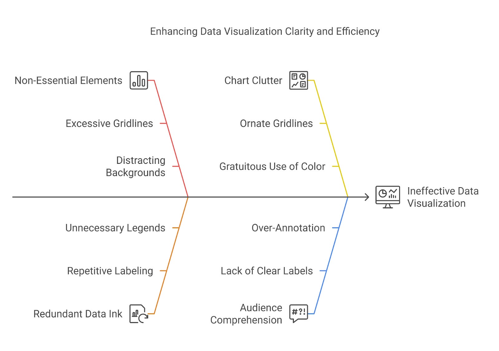
Chart clutter, often manifesting as "chartjunk," encompasses those visual elements that do not contribute to the understanding of the data and can, in fact, distract from it 26. Examples of common chartjunk include overly ornate or dark gridlines, unnecessary axis ticks and labels, redundant legends, gratuitous use of color or patterns, and the inappropriate application of three-dimensional effects to two-dimensional data 22. To effectively reduce clutter and enhance the data-ink ratio, several actionable strategies can be employed 4. Utilizing white space strategically can provide visual breathing room around data elements, improving readability and creating a clearer visual hierarchy 4.
Minimizing the number of data points displayed, especially when dealing with dense datasets, can prevent overwhelming the viewer; in some cases, aggregation or summarization techniques might be appropriate. Avoiding overly complex chart types that introduce visual noise without adding significant analytical value is also crucial 4. Clear and concise labeling of axes, data points, and other relevant elements ensures that the audience can easily interpret the visualization 4.
Finally, the strategic use of color should be aimed at highlighting key information and differentiating data categories in a meaningful way, rather than serving as a purely decorative element 4. The effective application of negative space, also known as white space, plays a pivotal role in improving the readability and overall impact of a visualization. By providing visual separation between data elements, white space reduces cognitive load, making it easier for the viewer to process the information.
It also contributes to establishing a clear visual hierarchy, naturally guiding the eye towards the most important aspects of the data story. This reduction in clutter, achieved through the thoughtful use of white space, ultimately leads to a more effective and easily understandable data visualization.
Weaving Insights into Narratives: Storytelling with Data
Beyond the clear and efficient presentation of data lies the art and science of storytelling with data 7. This involves the strategic process of communicating insights derived from data by constructing compelling narratives that resonate with the audience. It recognizes that while data provides the foundation of understanding, it is the narrative that provides context, meaning, and ultimately drives engagement and action. The power of data storytelling lies in its ability to combine the objective nature of data with the engaging and memorable qualities of a well-crafted story, often enhanced by effective visual representations 47.
To embark on this process effectively, it is crucial to first understand the intended audience, clearly define the objective of the communication, and diligently seek out the underlying story that the data reveals 7. Without a narrative framework, data, even when visualized with precision, may fail to connect with the audience on a meaningful level, potentially hindering understanding and limiting its impact. Raw data, irrespective of how effectively it is visualized, may not inherently resonate with an audience unless it is presented within a context that provides meaning and relevance. Storytelling fulfills this need by framing the data within a narrative arc, typically including a beginning, a middle, and an end. This structure enables the audience to understand the significance of the data and its connection to their own interests or objectives.
Structuring these narratives with clarity and engagement in mind is paramount. Several established narrative structures can be employed in data storytelling. The classic narrative arc, familiar from traditional storytelling, involves an introduction that sets the scene, a rising action that builds tension or presents the analysis, a climax that reveals the key insight or finding, and a resolution that provides a conclusion or call to action 43. Another useful framework is the "what, so what, now what" approach, which first presents the finding (what), then explains its significance (so what), and finally suggests the next steps or implications (now what) 60. Emphasizing the "power of three" by focusing on three key insights or recommendations can also enhance clarity and memorability 49.
Regardless of the chosen structure, the narrative should have a clear beginning that establishes the context, a middle that logically presents the data and its analysis, and a well-defined end that summarizes the key takeaways and potentially suggests future actions 43. A well-structured narrative significantly improves the audience's ability to follow the data story, understand the core messages, and ultimately retain the information being communicated. Similar to traditional storytelling, a clear structure provides a logical and coherent framework for presenting information.
This step-by-step approach aids the audience in processing the data and the resulting insights, leading to improved understanding and retention. In the absence of a clear narrative structure, the data story may feel fragmented and confusing, thereby diminishing its overall impact and effectiveness.
Identifying and highlighting the key insights within the data is a crucial aspect of effective data storytelling. This process involves employing various analytical techniques to uncover meaningful patterns, correlations, trends, and outliers within the dataset 20. Once these insights are identified, data visualizations can be strategically used to emphasize them through the thoughtful application of visual cues such as color, size, position, and annotations 4.
Furthermore, the use of speaking titles and subtitles that directly articulate the main insights can significantly enhance the clarity and impact of the visualization 8. Simply presenting raw data, even in a visually appealing format, is often insufficient. Effective data storytelling requires actively guiding the audience towards the most important findings and providing clear explanations of their significance within the broader context of the narrative.
Key insights form the core messages of the data story. To ensure that these messages are effectively communicated, storytellers need to employ visualization techniques that specifically draw the audience's attention to them.
This might involve using contrasting colors to make important data points stand out, strategically placing key metrics in visually prominent positions within the visualization, or adding annotations that directly explain the significance of particular findings.

The incorporation of annotations and contextual elements further enriches the data story. Annotations, such as labels, callouts, and arrows, can provide additional context, clarify the meaning of specific data points, and highlight important details within the visualization 4.
Providing sufficient context is also essential for the audience to fully understand the data being presented. This can include providing relevant baselines for comparison, establishing benchmarks against which performance can be measured, and offering comparisons to related datasets or time periods 1. It is also important to tailor the level of detail and the amount of context provided to the specific knowledge and needs of the intended audience 5.
Context plays a crucial role in enabling the audience to correctly interpret data visualizations and understand their overall relevance. Without adequate contextual information, even meticulously designed visuals can be easily misinterpreted or their significance overlooked. Data points presented in isolation often lack inherent meaning. By providing context, such as comparing current data to historical trends or relevant industry benchmarks, the audience gains a better understanding of the data's significance and can draw more meaningful conclusions.
Annotations serve to further enhance this understanding by offering specific explanations or drawing attention to particular aspects within the visualization.
Upholding Truth and Accuracy: Principles of Graphical Integrity
At the heart of effective data visualization lies the critical concept of graphical integrity, a set of principles articulated by Edward Tufte that emphasizes the paramount importance of truthful representation of data 30. These principles serve as a guide to ensure that visualizations accurately reflect the underlying data and avoid misleading the audience. Key among these principles is proportionality, which dictates that the visual representation of numbers, as measured on the graphic itself, should be directly proportional to the numerical quantities they represent. Clear and detailed labeling is also essential to prevent graphical distortion and ambiguity, with explanations of the data and labels for important events directly on the graphic itself 30.

Visualizations should showcase data variation, not design variation, meaning that changes in the graphic should reflect actual changes in the data, rather than being arbitrary design choices 30. In time-series displays of monetary data, it is almost always better to use deflated and standardized units to account for inflation and allow for meaningful comparisons over time 30. The number of information-carrying visual dimensions depicted should not exceed the number of dimensions in the data to avoid creating spurious interpretations 30.
Finally, graphics must not quote data out of context, ensuring that the presented information provides a complete and accurate picture 30. To quantify the degree of misrepresentation, Tufte introduced the "lie factor," calculated by dividing the size of the effect shown in the graphic by the actual size of the effect in the data 30. Maintaining graphical integrity is fundamental for establishing trust in data visualizations and ensuring that any decisions based on them are grounded in accurate and reliable information.
Data visualizations possess the inherent power to shape perceptions and influence decisions. If these visualizations inadvertently or intentionally distort the underlying data, they can lead to erroneous conclusions and potentially harmful actions. The principles of graphical integrity provide a crucial framework for creating visualizations that faithfully and accurately reflect the data, thereby fostering trust and ensuring the reliability of the information conveyed.
Despite the importance of graphical integrity, numerous common pitfalls and deceptive practices can undermine the accuracy and truthfulness of data visualizations. One frequent issue is the distortion of axes, such as starting the y-axis at a value other than zero, which can exaggerate trends and create a misleading impression of the magnitude of change 6.
Similarly, using inconsistent scales across multiple charts can confuse viewers and hinder accurate comparisons 67. The selection of inappropriate chart types for the data being presented can also lead to misinterpretations; for example, using a pie chart to represent trends over time is generally ineffective 34.
The practice of cherry-picking data, where only a subset of data that supports a particular narrative is presented while contradictory data is omitted, is a blatant violation of graphical integrity 35. The inappropriate use of three-dimensional effects can distort the perceived size and proportions of data elements, making accurate comparisons difficult 22. Even subtle manipulations like biased text modifications in titles or labels can subtly alter the audience's perception of the data 35.
These examples highlight that even seemingly minor design choices can have a significant impact on how data is perceived and understood. Therefore, visualization creators must maintain a high level of awareness regarding these common pitfalls and actively strive to avoid them in their work.
Even design choices that might seem unintentional can lead to the misrepresentation of data. It is therefore crucial for creators of visualizations to be acutely aware of these common pitfalls and to proactively take steps to avoid them in their design process.
The ethical considerations in data visualization extend beyond merely adhering to standard design practices; they encompass a broader responsibility to present information honestly, accurately, and without any form of bias 4. This includes maintaining transparency about the sources of data, the methodologies employed in its analysis and visualization, and any inherent limitations of the data 76.
Ethical data visualization also involves a careful consideration of privacy concerns, particularly when dealing with sensitive or personal data, ensuring that visualizations do not inadvertently reveal identifying information or breach confidentiality 76. Furthermore, it requires cultural sensitivity, acknowledging that perceptions of color, symbols, and other visual elements can vary significantly across different cultural contexts, and striving to create visualizations that are inclusive and respectful of diverse audiences 76.
The ethical responsibility of a data visualizer is to ensure that their creations do not mislead or misinform, even unintentionally, and to always prioritize the accurate and fair representation of the underlying data. Ethical data visualization transcends the simple application of design principles; it embodies a fundamental commitment to responsible communication and a deep consideration of the potential impact that visualizations can have on individuals and society as a whole.
Given that data visualizations have the power to influence opinions and shape decisions, it is incumbent upon their creators to uphold ethical principles that place a premium on accuracy, fairness, and transparency. This includes a constant vigilance against personal biases that might consciously or unconsciously skew the presentation of data, a strong commitment to protecting sensitive information and respecting individual privacy, and a deliberate effort to ensure that visualizations are accessible and readily understandable to a broad and diverse audience.
Understanding Visual Perception for Effective Design
The creation of truly effective data visualizations is deeply intertwined with an understanding of the fundamental principles of human visual perception 39. Our brains process visual information through a complex system that can be broadly categorized into low-level vision, also known as pre-attentive processing, and high-level vision, or focused attention 82. Pre-attentive processing operates rapidly and unconsciously, allowing us to quickly extract basic visual features from our environment, such as color, size, shape, and position 39.
This stage is crucial for capturing the viewer's initial attention and enabling them to quickly identify salient elements within a visualization. Following this initial processing, high-level vision involves focused attention and conscious interpretation, where our brains begin to recognize objects and patterns, drawing upon memory and prior knowledge to make sense of what we see 82.
The Feature Integration Theory posits that during the visual perceptual process, the low-level vision first broadly registers physical properties like color and shape, and then, approximately 200 milliseconds later, the high-level vision integrates these individual features to help us recognize and understand the complete object 82.
A fundamental understanding of how the human visual system processes information is therefore essential for designing data visualizations that are not only visually appealing but also easily and intuitively understood by the intended audience.
Data visualization is fundamentally about leveraging the inherent power of human visual perception. By gaining a deep understanding of how our brains process visual information, designers can create visualizations that align seamlessly with these natural cognitive mechanisms.
This alignment leads to a more efficient and ultimately more effective communication of the insights contained within the data.
The way in which we perceive and interpret various visual elements plays a critical role in the effectiveness of data visualization. Color, for instance, is a powerful visual attribute that can convey meaning, highlight patterns, and differentiate data categories 4. However, color perception is also influenced by cultural associations and can evoke different emotional responses 80. Furthermore, it is crucial to consider individuals with color vision deficiencies when selecting color palettes to ensure accessibility 80. Size and shape are also potent visual cues. Larger sizes are often perceived as indicating greater importance or magnitude, and certain shapes can trigger specific associations in the viewer's mind 4.
The spatial arrangement of data elements and their proximity to one another can significantly impact how we group and understand the relationships between them 4. The choice of visual elements in data visualization is far from arbitrary. Each element carries its own perceptual weight and can profoundly influence how the audience ultimately interprets the presented data. Color can serve to categorize different aspects of the data, draw attention to significant trends or outliers, and even evoke specific emotional responses.
The relative size of visual elements can be used to indicate the magnitude of the corresponding data values or their level of importance within the dataset. Similarly, the spatial arrangement of these elements, particularly their proximity to each other, can strongly suggest underlying relationships or groupings within the data.
By consciously and thoughtfully considering these various perceptual effects, visualization designers can make well-informed choices about the visual encoding of their data, thereby significantly enhancing the overall clarity and impact of their visualizations.

Leveraging Gestalt principles can further enhance the intuitiveness of data visualizations. These principles, rooted in the study of how humans perceive visual elements as organized patterns or wholes, offer valuable insights for design 39. The principle of proximity suggests that objects placed close together are perceived as being more related than those that are far apart 39. Similarity dictates that objects sharing similar visual characteristics, such as color, shape, or size, are grouped together by the brain 39.
Closure refers to our tendency to perceive incomplete shapes as complete 39. Continuity suggests that we perceive elements aligned along a line or curve as being more related than elements not aligned in this way 39. Enclosure describes how objects contained within a common region are perceived as belonging together 94. Connection implies that elements that are visually connected (e.g., by a line) are perceived as a single group 94.
The principle of figure-ground explains how we tend to perceive objects as being either in the foreground or the background, influencing what we focus on 39. By thoughtfully applying these Gestalt principles in data visualization, designers can create visualizations that align with our natural perceptual tendencies, making complex information more readily understandable and intuitive.
Gestalt principles provide a robust framework for designing visualizations that resonate with the way humans naturally perceive and organize visual information. By adhering to these principles, designers can create visuals that are not only aesthetically pleasing but also highly effective in communicating complex data in an intuitive manner.
Designing Engaging Interfaces: UI/UX for Data Visualization
The effectiveness of data visualization is not solely determined by the visual encoding of information but also by the user interface (UI) and user experience (UX) design, particularly in the context of dashboards and interactive platforms 40. For data visualization dashboards, several best practices in UI/UX design are crucial. Understanding the specific needs and objectives of the users is the foundational step in creating a successful dashboard 40. Establishing a clear visual hierarchy ensures that the most important information is immediately apparent and easily accessible 40. Maintaining consistency in design elements, such as color schemes, typography, and chart styles, across the dashboard contributes to a more intuitive and less overwhelming user experience 40.
Minimizing cognitive load by avoiding unnecessary visual clutter and presenting information in a digestible manner is essential for user comprehension 40. Ensuring accessibility for all users, including those with disabilities, through considerations like color contrast and alternative text for visual elements, is a critical aspect of responsible design 40.
Finally, the dashboard should emphasize actionable insights, guiding users towards understanding what the data means and what actions they might consider taking based on it 102. Organizing data logically, selecting appropriate visualizations for the data types and intended message, providing sufficient context through labels and annotations, and strategically highlighting key metrics all contribute to a well-designed and effective data visualization dashboard 40.
Given the increasing use of dashboards across various devices, responsive design is no longer optional; dashboards should adapt seamlessly to different screen sizes without losing functionality or clarity 41.
A thoughtfully designed data visualization dashboard transcends its role as a mere display of data; it becomes a powerful tool that provides a seamless and intuitive user experience, empowering users to efficiently explore, understand, and derive meaningful insights from the information presented.

For interactive data storytelling platforms, specific UI/UX principles come into play to encourage user engagement and facilitate exploration 3. Incorporating interactive elements such as tooltips that provide additional information on hover, zooming capabilities for detailed exploration, filtering options to narrow down the data, highlighting features to draw attention to specific aspects, and drill-down functionalities to explore data at different levels of granularity can significantly enhance the user experience 3.
Providing clear and intuitive navigation within the platform is crucial to ensure that users can easily find the information they need and understand how to interact with the visualizations 102. Offering guidance, such as introductory tours or contextual help, can also be beneficial, especially for new users 102.
Interactivity has the power to transform static data visualizations into dynamic tools for exploration and discovery. By providing users with the ability to actively engage with the data, these platforms empower them to ask their own questions and investigate the information from multiple perspectives, leading to more personalized and deeper insights.
Accessibility and usability are overarching considerations that must be integrated into the design of all data visualizations and their interfaces 3. Designing for accessibility ensures that visualizations can be understood and utilized by individuals with disabilities, including those with color blindness or visual impairments 3. This involves careful selection of color palettes that provide sufficient contrast and are distinguishable by individuals with different types of color vision deficiencies, as well as providing alternative text descriptions for all visual elements to aid screen reader users 81. Usability principles focus on making the visualizations and interfaces easy to use and understand for everyone.
This includes ensuring the legibility of text through appropriate font sizes and styles, maintaining adequate contrast between text and background colors, and using clear and consistent visual cues to indicate interactive elements and guide user interaction 3. To achieve optimal usability, it is essential to conduct thorough testing with representative users and to iterate on the designs based on the feedback received 8. Designing with accessibility and usability in mind ensures that data visualizations can be effectively understood and utilized by the widest possible audience, thereby promoting inclusivity and maximizing the impact of the information being conveyed. Accessibility considerations, such as the thoughtful selection of color palettes that accommodate individuals with color vision deficiencies and the provision of sufficient contrast for readability, are paramount for making data visualizations truly inclusive. Similarly, usability principles, which focus on ensuring that visualizations are easy to understand and interact with, are crucial for empowering all users to effectively extract the intended insights without unnecessary difficulty or frustration.
Deconstructing Visuals: Learning from Examples
The principles and best practices discussed thus far gain greater clarity and impact when viewed through the lens of real-world examples. Examining both effective and ineffective data visualizations provides invaluable lessons for aspiring designers and analysts.
Several historical and contemporary examples stand out as exemplars of effective data visualization. Charles Joseph Minard's map depicting Napoleon's 1812 campaign in Russia is often cited as one of the greatest visualizations ever created, elegantly combining multiple variables (troop size, direction, location, and temperature) to tell a powerful story of devastation 112. John Snow's 1854 map of the cholera outbreak in London is another landmark example, using a simple dot map to identify the source of the epidemic, leading to a significant public health breakthrough 100.
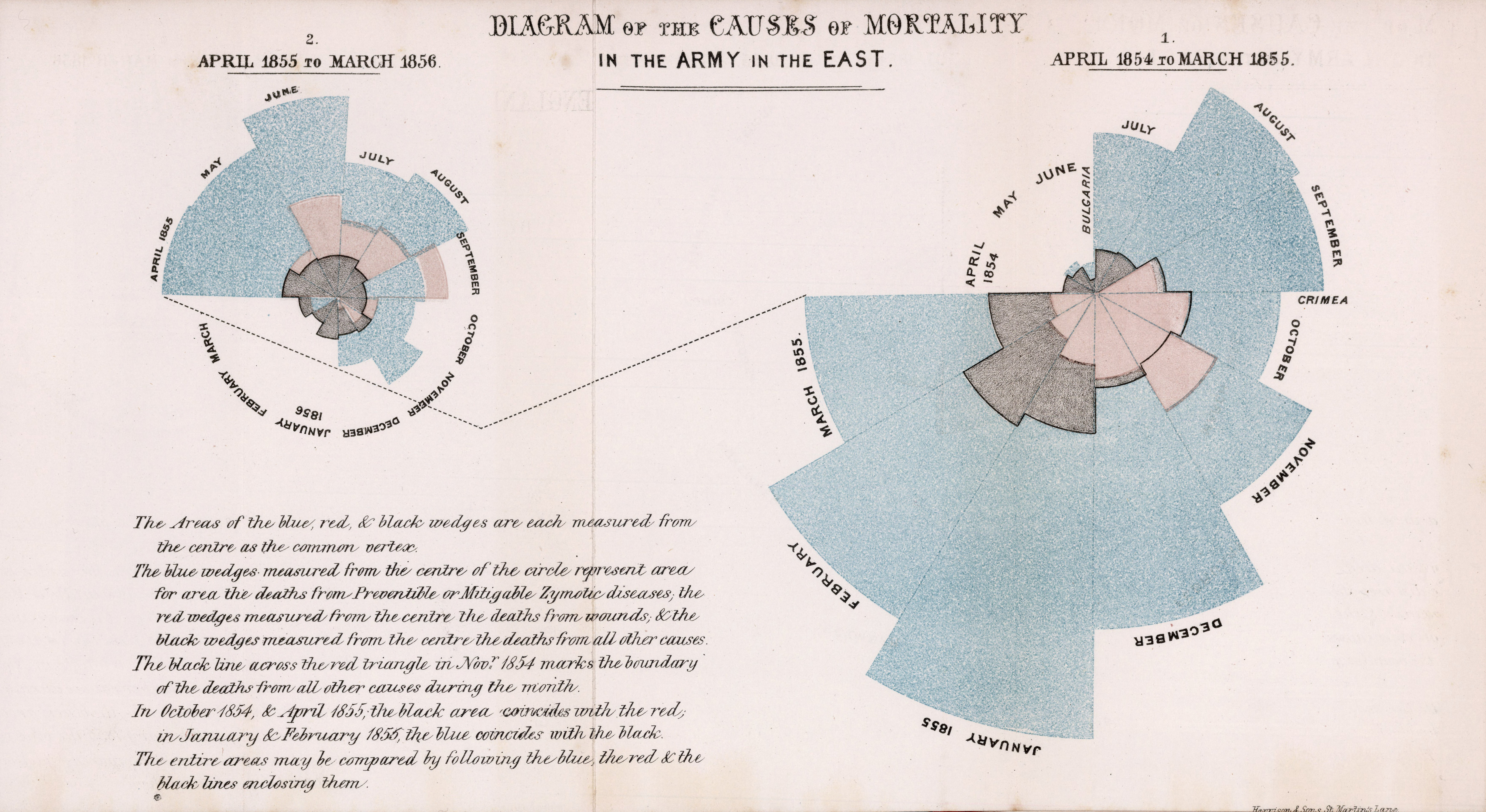
Florence Nightingale's rose chart illustrating the causes of mortality during the Crimean War effectively highlighted that the majority of deaths were due to preventable diseases rather than battle wounds, prompting crucial reforms in hospital practices 112. These visualizations, despite their historical context, continue to resonate because they embody the core principles of clarity, accuracy, and impactful storytelling 1. Modern examples of effective dashboards and interactive data stories abound, showcasing the power of well-designed interfaces to facilitate exploration and understanding 20.
Studying these successful examples offers valuable insights into how theoretical principles are translated into practical and impactful data representations. By carefully analyzing these esteemed data visualizations, students can gain a deeper understanding of how fundamental design principles, effective storytelling techniques, and thoughtful perceptual considerations are seamlessly integrated to communicate complex information with remarkable clarity and impact.
Examining the specific strengths of these examples provides invaluable practical guidance that students can directly apply to their own data visualization design endeavors.
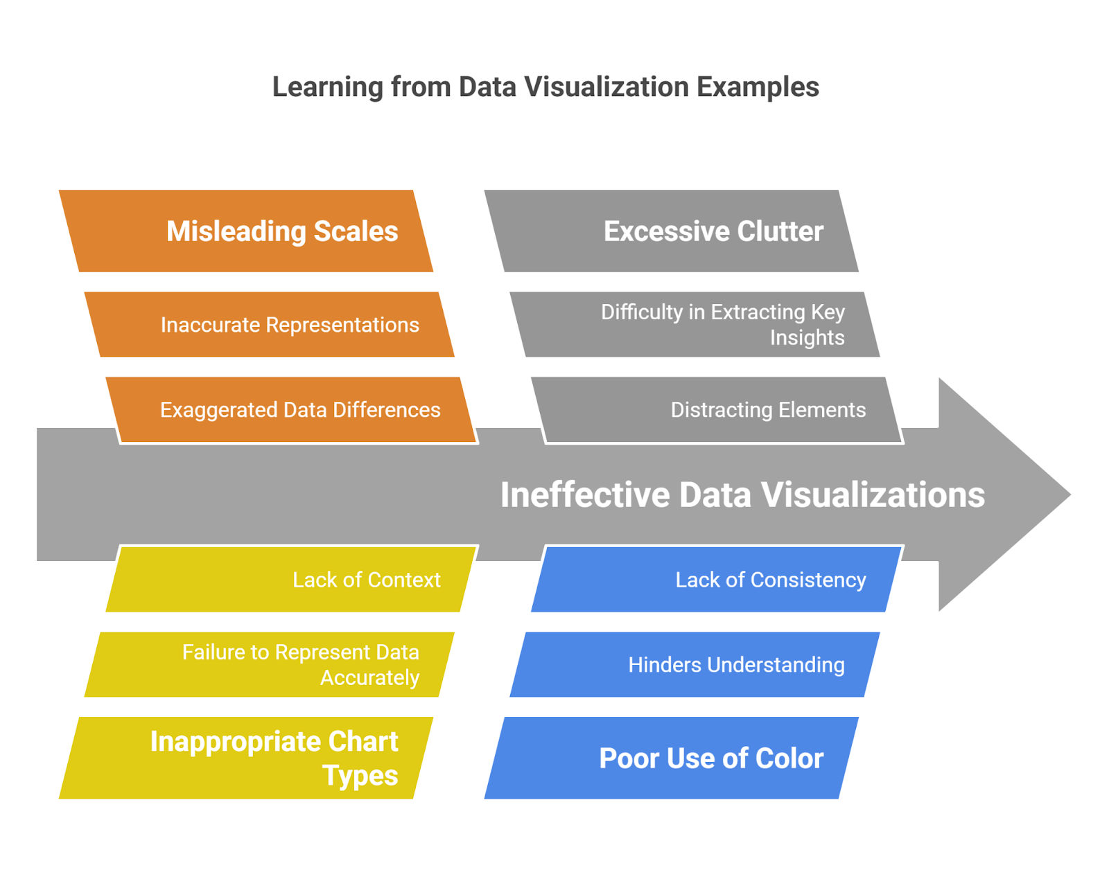
Conversely, examining ineffective data visualizations can be equally instructive, highlighting common mistakes and pitfalls to avoid. Examples such as charts with misleading scales that exaggerate or minimize differences in data, the selection of inappropriate chart types that fail to represent the data accurately, visualizations that suffer from excessive clutter making it difficult to discern key insights, and the poor use of color that hinders rather than helps understanding all serve as cautionary tales 34. Analyzing why these visualizations fail often reveals violations of the core principles of effective visualization and graphical integrity 9.
These failures can lead to misinterpretations of the data, flawed decision-making based on inaccurate perceptions, and ultimately a breakdown in communication 1. Learning from the mistakes evident in ineffective visualizations is crucial for developing the ability to critically evaluate data representations and to design effective ones that accurately and clearly convey the intended message. By gaining a thorough understanding of why certain visualizations fall short of their communicative goals, students can cultivate a heightened awareness of potential pitfalls that might arise in their own design processes.
This analysis of "bad" examples serves as a powerful reinforcement of the importance of consistently adhering to established principles and diligently avoiding common errors that can compromise the integrity and effectiveness of data visualizations.
Applications in Action: Data Visualization in AI and Analytics
The principles and techniques of data visualization find extensive application in a wide array of real-world scenarios, particularly within the dynamic fields of AI and data analytics 2. Across diverse industries such as healthcare, retail, finance, environmental science, and transportation, data visualization plays a pivotal role in transforming raw data into actionable insights 2.
In the healthcare sector, for instance, visualizations are used to track patient records, monitor disease outbreaks, and optimize resource allocation 2. The retail industry leverages data visualization to understand customer behavior, optimize operations, and improve sales strategies 2. Financial services firms rely on visualizations to interpret market trends, analyze customer data, and track financial transactions, enabling informed decision-making 2.
Environmental organizations and government agencies utilize data visualization to monitor environmental changes, track climate patterns, and assess the impact of pollution, informing policy decisions 2. The transportation sector employs visualization for traffic management, route optimization, and safety analysis 2. Real-world case studies consistently demonstrate the practical value of data visualization in tackling complex problems and driving informed decision-making across a multitude of domains, including the increasingly significant field of AI.
By examining how various organizations and researchers are actively employing data visualization in their day-to-day operations, students can gain a much deeper appreciation for its inherent power and remarkable versatility in extracting meaning from data.

Within the specific context of AI, data visualization plays an especially crucial role, not only as a means of communicating findings but also as a critical tool for understanding and improving AI models and their impact 17. Visualizations can aid in the interpretation of AI model outputs, such as by visualizing feature importance in machine learning algorithms, illustrating the performance of different models through comparison charts, or representing the results of natural language processing tasks like sentiment analysis 17. Furthermore, visualization can be instrumental in identifying potential biases or limitations within AI models by revealing patterns in the data that might indicate unfair or unintended outcomes 4.
By making complex analytical results more accessible to a wider range of stakeholders, including those without deep technical expertise in AI, visualization supports data-driven decision-making in AI applications, fostering transparency and promoting a better understanding of the capabilities and limitations of these powerful technologies 1.
As AI systems become increasingly integrated into various aspects of our lives, the ability to comprehend and interpret their behavior is of paramount importance. Data visualization provides essential tools for gaining insights into the inner workings of AI, identifying potential issues or unintended consequences, and ultimately ensuring that AI-driven decisions are both transparent and accountable.
Conclusion
Effective data visualization is an indispensable skill for professionals in AI and data analytics. It serves as the linchpin between complex data and human understanding, enabling the extraction of meaningful insights, the facilitation of informed decisions, and the clear communication of analytical findings. By adhering to the principles of effective visual display, maximizing the data-ink ratio, mastering the art of storytelling with data, upholding graphical integrity, understanding the nuances of visual perception, and designing user-centric interfaces, individuals can create powerful visualizations that not only inform but also inspire action. The study of both successful and unsuccessful examples, alongside the exploration of real-world applications within AI and data analytics, further solidifies the theoretical foundations and practical utility of these concepts. As AI continues to evolve and permeate various aspects of our lives, the ability to visualize and interpret complex AI outputs will become increasingly critical for ensuring transparency, accountability, and the responsible advancement of this transformative technology.
References
1. Day 51 — Principles of Effective Data Visualization | by Ricardo García Ramírez | Medium, accessed on March 20, 2025, https://medium.com/@rgr5882/100-days-of-data-science-day-51-principles-of-effective-data-visualization-5fe27eb39560
2. Data Visualization Case Studies: Lessons Learned - Alibaba Cloud, accessed on March 20, 2025, https://www.alibabacloud.com/tech-news/a/data_visualization/gu8c88sq41-data-visualization-case-studies-lessons-learned
3. 12 Principles of Data Visualization - Appnovation, accessed on March 20, 2025, https://www.appnovation.com/blog/12-principles-data-visualization
4. 10 Essential Data Visualization Design Principles for Clearer Insights - Tenscope Blog, accessed on March 20, 2025, https://www.tenscope.com/post/data-visualization-design-principles-for-clarity
5. 6 Most Useful Data Visualization Principles For Analysts - ThoughtSpot, accessed on March 20, 2025, https://www.thoughtspot.com/data-trends/data-visualization/data-visualization-principles
6. Data Visualization Principles With Good & Bad Examples - Ajelix, accessed on March 20, 2025, https://ajelix.com/data/data-visualization-principles/
7. 9 Data Storytelling Tips for More Effective Presentations - NetSuite, accessed on March 20, 2025, https://www.netsuite.com/portal/resource/articles/data-warehouse/data-storytelling-tips.shtml
8. Presenting Data | Digital Experience Studio | Michigan State University, accessed on March 20, 2025, https://dxstudio.msu.edu/analytics/data-visualization
9. 16 Guidelines for Effective Data Visualizations in Academic Papers - Luís Cruz, accessed on March 20, 2025, https://luiscruz.github.io/2021/03/01/effective-visualizations.html
10. Highlighting Key Insights with Data Annotations - One Model, accessed on March 20, 2025, https://www.onemodel.co/product-innovation-blog/highlighting-key-annotations
11. Every CHART Types Explained in 12 Minutes - YouTube, accessed on March 20, 2025,
12. A Guide To Charts: What They Are, Examples & Types | Tableau, accessed on March 20, 2025, https://www.tableau.com/chart
13. Available chart types in Office - Microsoft Support, accessed on March 20, 2025, https://support.microsoft.com/en-us/office/available-chart-types-in-office-a6187218-807e-4103-9e0a-27cdb19afb90
14. Essential Chart Types for Data Visualization | Atlassian, accessed on March 20, 2025, https://www.atlassian.com/data/charts/essential-chart-types-for-data-visualization
15. Data Visualization — How to Pick the Right Chart Type? | by Mokkup ..., accessed on March 20, 2025, https://medium.com/@mokkup/data-visualization-how-to-pick-the-right-chart-type-f6f65824928a
16. Visualizing Quantitative Data: Best Practices - Ajelix, accessed on March 20, 2025, https://ajelix.com/data/visualizing-quantitative-data-best-practices/
17. 11 Data Visualization Techniques for Every Use-Case with Examples - DataCamp, accessed on March 20, 2025, https://www.datacamp.com/blog/data-visualization-techniques
18. AI Data Visualization: Types, Examples, and Tools | by sdhglobal | Medium, accessed on March 20, 2025, https://medium.com/@sdhglobal/ai-data-visualization-types-examples-and-tools-4c018cc88e39
19. 7 Best Data Visualization Techniques - Julius AI, accessed on March 20, 2025, https://julius.ai/articles/data-visualization-techniques
20. 10 Ways to Visualize Data Effectively: Examples & Tips - Sisense, accessed on March 20, 2025, https://www.sisense.com/blog/10-useful-ways-visualize-data-examples/
21. www.codeconquest.com, accessed on March 20, 2025, https://www.codeconquest.com/blog/data-ink-ratio-explained-with-example/#:~:text=Edward%20Tufte%20has%20defined%20the,total%20elements%20in%20the%20image.
22. The manifesto of the data-ink ratio - Liquid, accessed on March 20, 2025, https://blog.liquidinteractive.com.au/the-manifesto-of-the-data-ink-ratio
23. Data Ink Ratio | Why it matters?, accessed on March 20, 2025, https://www.thedataschool.co.uk/nitesh-shrestha/data-ink-ratio-why-it-matters
24. Data-ink Ratio Explained With Example - Code Conquest, accessed on March 20, 2025, https://www.codeconquest.com/blog/data-ink-ratio-explained-with-example/
25. Data-ink Ratio Animation: How to Simplify Data Visualization, accessed on March 20, 2025, https://deliveringdataanalytics.com/the-data-to-ink-ratio-chart-makeover/
26. How Data-Ink Ratio Imposed Minimalism on Data Visualization - Performance Magazine, accessed on March 20, 2025, https://www.performancemagazine.org/data-ink-ratio-minimalism-data-visualization/
27. www.holistics.io, accessed on March 20, 2025, https://www.holistics.io/blog/data-ink-ratio/#:~:text=The%20data%2Dink%20ratio%20is,all%20else%20show%20the%20data.%E2%80%9D
28. The Data-ink ratio - simplexCT, accessed on March 20, 2025, https://simplexct.com/data-ink-ratio
29. The Gospel According to Tufte, accessed on March 20, 2025, http://www-personal.umich.edu/~jpboyd/eng403_chap2_tuftegospel.pdf
30. Tufte's Principles - thedoublethink, accessed on March 20, 2025, https://thedoublethink.com/tuftes-principles-for-visualizing-quantitative-information/
31. Mastering Tufte's Data Visualization Principles - GeeksforGeeks, accessed on March 20, 2025, https://www.geeksforgeeks.org/mastering-tuftes-data-visualization-principles/
32. Why Reducing Visual Clutter Maximizes Data Impact - BioRender.com, accessed on March 20, 2025, https://www.biorender.com/blog/why-reducing-visual-clutter-maximizes-data-impact
33. Data-ink Ratio: How to Simplify Data Visualization - Holistics, accessed on March 20, 2025, https://www.holistics.io/blog/data-ink-ratio/
34. 5 Critical Mistakes to Avoid in Data Visualization - Toucan Toco, accessed on March 20, 2025, https://www.toucantoco.com/en/blog/5-critical-mistakes-to-avoid-in-data-visualization
35. Misleading Data Visualization - What to Avoid - Coupler.io Blog, accessed on March 20, 2025, https://blog.coupler.io/misleading-data-visualization-examples/
36. 10 Ways to Mislead with Data Visualization - PolicyViz, accessed on March 20, 2025, https://policyviz.com/2023/02/07/10-ways-to-mislead-with-data-visualization/
37. 10 Good and Bad Examples of Data Visualization in 2024 - Polymer Search, accessed on March 20, 2025, https://www.polymersearch.com/blog/10-good-and-bad-examples-of-data-visualization
38. Review of Tufte's "The Visual Display of Quantitative Information" | Benjamin LeRoy's Blog, accessed on March 20, 2025, https://benjaminleroy.github.io/pages/blog/public/post/2018/05/16/review-of-tufte-s-the-visual-display-of-quantitative-information/
39. Principles of Visual Perception to Know for Data Visualization for Business - Fiveable, accessed on March 20, 2025, https://fiveable.me/lists/principles-of-visual-perception
40. Effective Dashboard Design Principles for 2025 - UXPin, accessed on March 20, 2025, https://www.uxpin.com/studio/blog/dashboard-design-principles/
41. Best Practices for Designing Dashboards | by Niamh O'shea, accessed on March 20, 2025, https://niamh-oshea.medium.com/best-practices-for-designing-dashboards-7cb8a0a00ff4
42. Data Storytelling & Communication Cheat Sheet - DataCamp, accessed on March 20, 2025, https://www.datacamp.com/cheat-sheet/data-storytelling-and-communication-cheat-sheet
43. 7 Data Storytelling Techniques to Build Dashboards That Engage your Customers - Toucan, accessed on March 20, 2025, https://www.toucantoco.com/en/blog/7-data-storytelling-techniques-to-engage-your-customers
44. Data Storytelling: How to Tell a Great Story with Data - ThoughtSpot, accessed on March 20, 2025, https://www.thoughtspot.com/data-trends/best-practices/data-storytelling
45. 4 storytelling techniques to bring your data to life | Duarte, accessed on March 20, 2025, https://www.duarte.com/blog/four-storytelling-techniques-to-bring-your-data-to-life/
46. 8 examples of powerful data storytelling - Shorthand, accessed on March 20, 2025, https://shorthand.com/the-craft/examples-of-powerful-data-storytelling/index.html
47. Data Storytelling: A Guide For Effective Data Narratives - Prezlab, accessed on March 20, 2025, https://prezlab.com/data-storytelling-a-guide-for-effective-data-narratives/
48. What is Data Storytelling and Data Storytelling Examples | Microsoft Power BI, accessed on March 20, 2025, https://powerbi.microsoft.com/en-my/data-storytelling/
49. Mastering the Art of Data Storytelling: Strategies for Engaging and Impactful Narratives | by Dossier Analysis | Medium, accessed on March 20, 2025, https://medium.com/@dossieranalysis/mastering-the-art-of-data-storytelling-strategies-for-engaging-and-impactful-narratives-0abc25864319
50. Turning Data Into Insights-How to use Data Visualization for Storytelling – Highcharts Blog, accessed on March 20, 2025, https://www.highcharts.com/blog/tutorials/turning-data-insights-use-data-visualization-storytelling/
51. Data Storytelling: 6 Tips To Help You Tell Effective Data Stories - GoodData, accessed on March 20, 2025, https://www.gooddata.com/blog/data-storytelling-tips-to-help-you-tell-effective-data-stories/
52. Storytelling with Data: Crafting Engaging User Experiences through Insightful Narratives | by Isabel | Bootcamp | Medium, accessed on March 20, 2025, https://medium.com/design-bootcamp/storytelling-with-data-crafting-engaging-user-experiences-through-insightful-narratives-8268de964ee1
53. Data Visualization Case Study - Medium, accessed on March 20, 2025, https://medium.com/@melisaltinoluk/data-visualization-case-study-1287da085ff4
54. What is Data Storytelling and Data Storytelling Examples | Microsoft Power BI, accessed on March 20, 2025, https://powerbi.microsoft.com/en-us/data-storytelling/
55. AI Data Storytelling: 6 Ways to Enhance Your Insights - DataCamp, accessed on March 20, 2025, https://www.datacamp.com/blog/ai-data-storytelling
56. The Enduring Power of Data Storytelling in the Generative AI Era, accessed on March 20, 2025, https://sloanreview.mit.edu/article/the-enduring-power-of-data-storytelling-in-the-generative-ai-era/
57. 20 Best Storytelling Examples - Juice Analytics, accessed on March 20, 2025, https://www.juiceanalytics.com/writing/20-best-data-storytelling-examples
58. medium.com, accessed on March 20, 2025, https://medium.com/@dossieranalysis/mastering-the-art-of-data-storytelling-strategies-for-engaging-and-impactful-narratives-0abc25864319#:~:text=Introduce%20the%20protagonist%20(the%20data,to%20ensure%20clarity%20and%20focus.
59. Data Storytelling 101: 5 Tips to Structure Your Data Stories - Gramener Blog, accessed on March 20, 2025, https://blog.gramener.com/data-storytelling-tips-to-structure-data-stories/
60. Tips for storytelling in data science presentations? : r/datascience - Reddit, accessed on March 20, 2025, https://www.reddit.com/r/datascience/comments/1cdacxm/tips_for_storytelling_in_data_science/
61. Mastering Data Visualization: Impactful Insights - Decision Foundry, accessed on March 20, 2025, https://www.decisionfoundry.com/data/articles/mastering-data-visualization-impactful-insights/
62. Guidelines for Good Visual Information Representations | IxDF, accessed on March 20, 2025, https://www.interaction-design.org/literature/article/guidelines-for-good-visual-information-representations
63. Edward Tufte 's Principles of Graphical Integrity - Temple MIS, accessed on March 20, 2025, https://community.mis.temple.edu/mis5208sp18/2017/04/22/edward-tufte-s-principles-of-graphical-integrity/
64. Data Visualization Principles Flashcards | Quizlet, accessed on March 20, 2025, https://quizlet.com/627120910/data-visualization-principles-flash-cards/
65. www.goldensoftware.com, accessed on March 20, 2025, https://www.goldensoftware.com/data-visualization-best-practices/#:~:text=One%20of%20the%20most%20common,skewed%20understanding%20of%20your%20data.
66. What Is Data Visualization: Common Mistakes and Pitfalls - Adverity, accessed on March 20, 2025, https://www.adverity.com/blog/what-is-data-visualization-common-mistakes-and-pitfalls
67. 10 Data Visualization Best Practices to Overcome Common Mistakes - Golden Software, accessed on March 20, 2025, https://www.goldensoftware.com/data-visualization-best-practices/
68. 10 Common Data Visualization Mistakes and How to Avoid Them | by Agoda Engineering, accessed on March 20, 2025, https://medium.com/agoda-engineering/10-common-data-visualization-mistakes-and-how-to-avoid-them-e3896fe8e104
69. Ethical data visualization: best practices for marketers - Funnel, accessed on March 20, 2025, https://funnel.io/blog/ethical-data-visualization-marketing-best-practices
70. Bad Data Visualization: 9 Examples to Learn From - Luzmo, accessed on March 20, 2025, https://www.luzmo.com/blog/bad-data-visualization
71. Bad Data Visualization: 5 Examples of Misleading Data - HBS Online, accessed on March 20, 2025, https://online.hbs.edu/blog/post/bad-data-visualization
72. Misleading Data Visualizations – Critical Data Literacy, accessed on March 20, 2025, https://pressbooks.library.torontomu.ca/criticaldataliteracy/chapter/misleading-data-visualizations/
73. Best and Worst Data Visualizations Examples | Vizzu, accessed on March 20, 2025, https://www.vizzu.io/blog/data-visualization-examples
74. Top 8 Data Visualization Examples: Good, Bad, and Prohibited - Ninja Tables, accessed on March 20, 2025, https://ninjatables.com/bad-data-visualization-examples/
75. Good and bad data visualization examples | Infogram.com, accessed on March 20, 2025, https://infogram.com/blog/good-data-visualization-examples/
76. Principles of Ethical Data Visualisation - Ei Square, accessed on March 20, 2025, https://www.eisquare.co.uk/blogs/ethical-data-visualisation
77. Ethics and ethical data visualization: A complete guide - viborc.com, accessed on March 20, 2025, https://viborc.com/ethics-and-ethical-data-visualization-a-complete-guide/
78. Ethics in Data Visualization: Representing Information Responsibly - Alibaba Cloud, accessed on March 20, 2025, https://www.alibabacloud.com/tech-news/a/data_visualization/4oebeafy57v-ethics-in-data-visualization-representing-information-responsibly
79. Ethics of Data Visualization: Avoiding Deceptive Practices - Analytico, accessed on March 20, 2025, https://www.analyticodigital.com/blog/ethics-of-data-visualization-avoiding-deceptive-practices
80. The Impact of Color Choices on Data Visualization Effectiveness, accessed on March 20, 2025, https://bigblue.academy/en/the-impact-of-color-choices-on-data-visualization-effectiveness
81. 10 Data Visualization UX Best Practices in SaaS - Userpilot, accessed on March 20, 2025, https://userpilot.com/blog/data-visualization-ux-best-practices/
82. Use the Perceptual Process to Build Better Data Visualizations - Atlan, accessed on March 20, 2025, https://humansofdata.atlan.com/2019/01/perceptual-process-data-visualization/
83. 35. Data Visualization for Human Perception - The Interaction Design Foundation, accessed on March 20, 2025, https://www.interaction-design.org/literature/book/the-encyclopedia-of-human-computer-interaction-2nd-ed/data-visualization-for-human-perception
84. Chapter 3 Visual Perception and Colour | Data Visualisation: From Theory to Practice, accessed on March 20, 2025, https://dark-star-161610.appspot.com/secured/_book/visual-perception-and-colour.html
85. medium.com, accessed on March 20, 2025, https://medium.com/microsoft-power-bi/data-visualization-101-leveraging-color-psychology-for-effective-dashboards-reports-31c019155367#:~:text=Part%203%3A%20Common%20Color%20Perception,peace%2C%20trust%2C%20and%20sadness.
86. Data Visualization 101: Leveraging Color Psychology for Effective Dashboards & Reports | by Iwa Sanjaya | Microsoft Power BI | Medium, accessed on March 20, 2025, https://medium.com/microsoft-power-bi/data-visualization-101-leveraging-color-psychology-for-effective-dashboards-reports-31c019155367
87. Use of Color in Data Visualization - NASA Earth Observatory, accessed on March 20, 2025, https://earthobservatory.nasa.gov/resources/blogs/intro_to_color_for_visualization.pdf
88. Colors and Emotions in Data Visualization - Cédric Scherer, accessed on March 20, 2025, https://www.cedricscherer.com/2021/06/08/colors-and-emotions-in-data-visualization/
89. The Role of Color Psychology in Market Data Visualization - Bookmap, accessed on March 20, 2025, https://bookmap.com/blog/the-role-of-color-psychology-in-market-data-visualization
90. www.alibabacloud.com, accessed on March 20, 2025, https://www.alibabacloud.com/tech-news/a/data_visualization/gu8c88sbpr-the-psychology-behind-effective-data-visualizations#:~:text=Larger%20shapes%20or%20sizes%20are,might%20symbolize%20continuity%20or%20wholeness.
91. The Psychology Behind Effective Data Visualizations - Alibaba Cloud, accessed on March 20, 2025, https://www.alibabacloud.com/tech-news/a/data_visualization/gu8c88sbpr-the-psychology-behind-effective-data-visualizations
92. The intricate process of encoding data in your data visuals, accessed on March 20, 2025, https://www.guidetoinsights.com/blog/All%20Articles/encoding%20data.html
93. The Psychology of Data Visualization: Unlocking the Power of Perception | by Faraz Mubeen | Medium, accessed on March 20, 2025, https://medium.com/@farazmubeen902/the-psychology-of-data-visualization-unlocking-the-power-of-perception-c8cb8cd94b92
94. Data Viz Best Practices: 7 Gestalt principles for Data Visualizations - Toucan, accessed on March 20, 2025, https://www.toucantoco.com/en/blog/data-viz-best-practices-gestalt-principles
95. Gestalt Principles in Data Visualization | by Anastasiya Kuznetsova - Medium, accessed on March 20, 2025, https://nastengraph.medium.com/gestalt-principles-in-data-visualization-a4e56e6074b5
96. Top 10 Gestalt Principles That Every Designer Should Know - GeeksforGeeks, accessed on March 20, 2025, https://www.geeksforgeeks.org/top-gestalt-principles-that-every-designer-should-know/
97. How to Make Data Visualization Better with Gestalt Laws - WebFX, accessed on March 20, 2025, https://www.webfx.com/blog/web-design/data-visualization-gestalt-laws/
98. Introduction to Data Visualization: Gestalt Principles, accessed on March 20, 2025, https://www.thedataschool.co.uk/nayeli-jaime/introduction-to-data-visualization-gestalt-principles/
99. Data Visualization Design Guidelines - The CMU Brand - Carnegie Mellon University, accessed on March 20, 2025, https://www.cmu.edu/brand/brand-guidelines/data-viz.html
100. Comparing Best and Bad Data Visualization Examples - PageOn.ai, accessed on March 20, 2025, https://www.pageon.ai/blog/data-visualization-examples
101. Data Visualization UX Best Practices (Updated 2025) - UI design by Design Studio, accessed on March 20, 2025, https://www.designstudiouiux.com/blog/data-visualization-ux-best-practices/
102. 9 Dashboard Design Principles (2025) | DesignRush, accessed on March 20, 2025, https://www.designrush.com/agency/ui-ux-design/dashboard/trends/dashboard-design-principles
103. Dashboard UI Design: 14 Best Practices for Stakeholders | Adam Fard Studio, accessed on March 20, 2025, https://adamfard.com/blog/dashboard-ui
104. Dashboard Design: best practices and examples - Justinmind, accessed on March 20, 2025, https://www.justinmind.com/ui-design/dashboard-design-best-practices-ux
105. Dashboard Design: 7 Best Practices & Examples - Qlik, accessed on March 20, 2025, https://www.qlik.com/us/dashboard-examples/dashboard-design
106. The Intersection of Data Visualization and UX Design - UXmatters, accessed on March 20, 2025, https://www.uxmatters.com/mt/archives/2023/03/the-intersection-of-data-visualization-and-ux-design.php
107. Data Visualization Tips and Best Practices - Tableau, accessed on March 20, 2025, https://www.tableau.com/visualization/data-visualization-best-practices
108. The importance of storytelling in UI/UX design - Nulab, accessed on March 20, 2025, https://nulab.com/learn/design-and-ux/storytelling-in-user-experience/
109. Data Visualization UI/UX Design Services - Flatirons Development, accessed on March 20, 2025, https://flatirons.com/services/data-visualization-ui-ux-design/
110. Data Storyteller - aescripts.com, accessed on March 20, 2025, https://aescripts.com/data-storyteller/
111. Visual storytelling for a better UX design - Justinmind, accessed on March 20, 2025, https://www.justinmind.com/ux-design/visual-storytelling
112. Data Is Beautiful: 10 Best Data Visualization Examples From History & Today - Tableau, accessed on March 20, 2025, https://www.tableau.com/visualization/data-visualization-examples
113. The Visual Display of Quantitative Information, accessed on March 20, 2025, https://www.econ.upf.edu/~michael/visualdata/tufte-aesthetics_and_technique.pdf
114. Data Visualization: Good and Bad Visualizations - LibGuides at University of Texas at Austin, accessed on March 20, 2025, https://guides.lib.utexas.edu/data-visualization/examples
115. The 30 Best Data Visualizations of 2025 [Examples] - Visme, accessed on March 20, 2025, https://visme.co/blog/best-data-visualizations/
116. Good and Bad Examples of Data Visualization | Article by PixelPLex, accessed on March 20, 2025, https://pixelplex.io/blog/good-and-bad-examples-of-data-visualization/
117. Data Visualization Case Studies - Datalabs Agency, accessed on March 20, 2025, https://www.datalabsagency.com/case-studies/
118. 12 Tableau Case Studies to Inspire You in 2024 - XeoMatrix, accessed on March 20, 2025, https://www.xeomatrix.com/blog/12-tableau-case-studies-to-inspire-you-in-2024/
119. Case Studies | Vizio AI, accessed on March 20, 2025, https://www.vizio.ai/case-studies
120. Data Visualization Case Study - Kopius, accessed on March 20, 2025, https://kopiustech.com/case-studies/data-visualization-poc/
121. Case Studies in Data Visualization - SolveForce, accessed on March 20, 2025, https://solveforce.com/31-3-data-visualization-case-studies-in-data-visualization/
122. Visualisation Case Studies | Data Science Institute | Imperial College London, accessed on March 20, 2025, https://www.imperial.ac.uk/data-science/facilities/data-observatory/visualisation-case-studies/